process

"How do you decide what to paint?"

Johnsen Commission concept photo (for future 30" x 60" painting)

Johnsen Commission concept photo (for future 30" x 60" painting)

WHERE TO START...

One of the questions I'm often asked is how I decide what to paint. That question is most easily answered if said answer is dictated by the desires of a client for a painting that is commissioned. Obviously, for a painting commission, the client tells me what they want. That makes it easy (and usually a lot of fun because the subject could be almost ANYTHING).

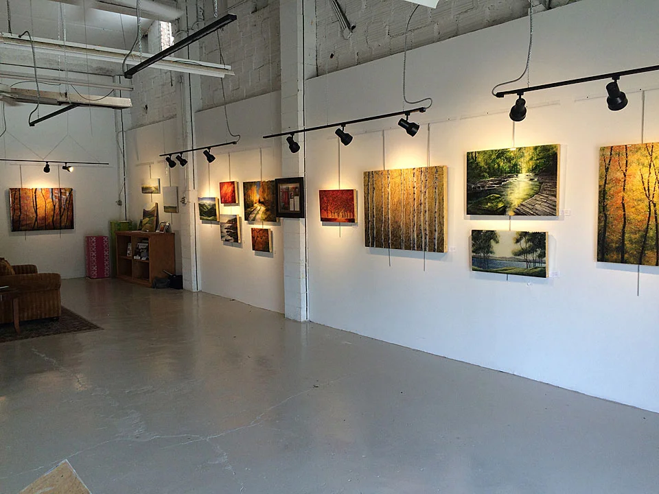
When I'm just painting something to fill my walls here at my art studio in Asheville, then the answer is a lot more subjective. I usually am trying to keep an ear open at all times to what seems to be resonating with people as they enter my studio/gallery. That helps dictate what I will be working on next. See, my work station (where I do 85% of my work) is located just inside the door to my studio, so I'm right there, meeting and greeting people (and hopefully) painting. I hear people's comments (sometimes they crack me up!) so I know what is interesting to people. That helps me so much when I need to sit down and figure out what to paint to replace something that's sold.

SEASONAL?

One thing I've learned is to think one season ahead. Right now it's autumn. But right now, I've got an entire wall full of winter themed paintings and I've got more in the pipeline. The winter scenes are hot now through the holidays. As soon as "REAL" winter settles in and we're under snow pack and fighting freezing rain and sleet, then the appeal of snow scenes wears off. But that won't happen until January 1. As soon as it hits January, I'm painting spring scenes and by May, it's full-on summer scenes. I think this is because the human heart loves to anticipate the next season, but when we're "in the MIDST" of that season, we get bored and are longing for the next season. This is all new to me -- I grew up in southern California and we really didn't have much in the way of seasons at all, but the rhythm four seasons in Western North Carolina brings to life is just wonderful I think. I'm so glad to be living now in a place with four real seasons, because I love to paint all four (the Blue Ridge Mountains are spectacular all year round).

When I'm painting an abstract, then usually I just take a look at the "in" colors that are hot for decorating and I use those colors. Usually.

In the end though, I paint what makes me happy. There. True confessions. That's how I decide what to paint. Enough writing now...back to work.

Cheers!

Then and Now

A few weeks ago, I was staring at (in my opinion) one of the most beautiful statues in the world, Michelangelo's "David". The piece is absolutely astonishing. At the Galleria dell' Accademia in Florence, there are several other statues by other artists and I could not help but compare them to David. The difference is astonishing. The other pieces I saw were beautiful and skillfully worked, but in no way could be compared to David. Other pieces had arms but David had blood vessels and sinews. David is nearly alive. The skill to create such a masterpiece is mind boggling. That much is patently obvious.

David (2).JPG

Michelangelo's "David"

As opposed to the "victory pose" over the fallen giant Goliath, Michelangelo's David appears to depict the youth just moment after he has made the decision to fight giant but before the battle has actually taken place, a moment between conscious choice and action. His brow is drawn, his neck tense and the veins bulge out of his lowered right hand. His left hand holds a sling that is draped over his shoulder and down to his right hand, which holds a rock.  The twist of his body effectively conveys to the viewer the feeling that he is in motion, an impression heightened with contrapposto (an asymmetrical arrangement of the human figure in which the line of the arms and shoulders contrasts with while balancing those of the hips and legs). There is your art history "lesson of the day". This classic pose causes the figure’s hips and shoulders to rest at opposing angles, giving a slight s-curve to the entire torso. The contrapposto is emphasized by the turn of the head to the left, and by the contrasting positions of the arms.

Compare and think...

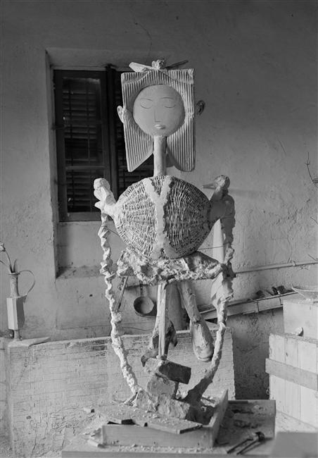
So that was then, this is now. Times change I guess. See, when I got back home to the States, I saw a poster of a statue Picasso had created and I could not help but compare it to David, just as I compared the other statues I saw in Florence. So here's a good little exercise for you: Compare and think. What are you thinking? (I'd really like to know.)

89-008804.jpg

Pablo Picasso's "Petite fille sautant a la corde" 

Here is what High Five magazine says about Picasso's sculpture:   

"Pablo Picasso's work remains astonishing. It is not limited to painting. The incursions of the Spanish master, especially in sculpture, produced admirable results."

"Before 1950, when the "Petite fille sautant à la corde" (or "Little Girl jumping rope) was completed, the practice of sculpture in Picasso seems episodic, according to the pictorial reinvention that crosses his work. Having no training in construction, unlike a classical training in painting, the sculpture remains for Picasso a hobby (if I may say), as a fun place to express his free creativity."

"Although Picasso prefers to use his brushes, he remains an inventive sculptor, motivated by the desire for experimentation. Picasso is a man constantly torn by the need to rebuild. He is reappropriating formal objects, technical innovations and artistic breaks to give his work a new impetus."

"Valley of Shadows"

"Valley of Shadows" is taking shape, and it is haunting. This is really the most difficult piece I've ever done. I find I can only work on it for about 20 minutes at a time. The texture is nearly laid and should be ready to cover with the aluminum leaf shortly. I really enjoy painting beauty and this is not beautiful at all. I hope it's powerful though.

I find it difficult to interact with people coming into my River Arts District studio while I'm working on this piece. Seriously! "Oh!" says some woman from any random state in the U.S. upon entering the studio. "Look George! The artist is working!" (This is my studio. Of course I'm working.) "What are you working on?" she asks excitedly.

How do I explain what I'm working on? "Well, I'm depicted corpses at the moment". What do I say? I try to work on this first thing in the morning, before many people are wondering in. Folks, this is really difficult.

Everything else I paint, I am completely fine with being interrupted with questions and with people coming around my desk for a closer look at what I'm working on at the moment. This one is different. I feel like the time I am working on this is holy. Truly sacred. I don't want it interrupted.

So if you're reading this and you're a recent early morning visitor to my studio and wondered why the artist was so aloof and in his own little world, well...now you know. I apologize. I really was in my own little world, but I had to be there. I had to be focused. I had to listen in my head. So difficult. I would much prefer painting mountain scenes around Asheville. 

River Arts District painting 1
River Arts District painting 2
River Arts District painting 3

Valley of Shadows

inspiration for new oil painting

While we were in Germany the last couple of weeks, one of the things I needed to do was to visit what remains of the concentration camp at Dachau, just outside of Munich. I needed to see it because several weeks ago, a gentleman visited my Asheville studio and asked me to consider doing a painting commission based on the Holocaust, which was the strangest and most daunting request for an art commission I'd ever received. But I felt like this was something I needed to do.

The commission itself did not work out, but the idea was planted in my head and it's been growing. It will be dark and disturbing, but artists before me have depicted dark and disturbing subjects before (Goya comes to mind). So I wanted to visit Dachau (since it's so close to Munich where we were staying) and soak it in -- let it do in my heart whatever it wanted to do so that I could then depict that in my future painting.

It was not pleasant.

The only way I could take it in was to not fully take it all in. I don't know how anyone can "fully" take it in. I felt myself hardening while I strolled slowly through the grounds. Row upon row of barracks foundations still stand, and I felt a horrible weight. I've never felt anything so miserable and dark and dreadful before.

Row upon row of barracks.

Close your eyes and you still can't imagine the pain of the place. These were real human lives and I wanted to hear them but again, I felt a self-protective "deadening" of my heart. It was the only way I could keep walking; could keep "listening".

It got darker still.

We walked into the very room where people were told to strip. We walked into the next room, tiled floor to ceiling as though it were a shower. I walked into that dark room, silent now but you can still feel a horrible weightiness there. Crushing.

We saw rafters in front of crematory ovens from which people were hung, so that the last thing on this earth they would see would be the open oven door.

No one speaks at Dachau. Communication is in short whispers. It is a holy and horrible place. No one knows how to take it all in and comprehend it. How can you? How can you even begin?

How did this happen? Germany was not a third world country full of back-woods people controlled by superstition. They were a major western civilization, full of creative people. It was a country full of world famous musicians, painters, writers and scientists. But it was a struggling country. They felt like they were not in control of their destiny anymore. They wanted Germany to be great again and they found someone who promised the moon. And then they turned their head when the horrors began to happen. How could this have happened? I think the scenario sounds hauntingly familiar. Similar things could happen anywhere in any generation unless we remember and learn from the past. If you listen, in places like Dachau, the past still has a voice and it is dark and absolutely crushing.

I know now what I need to paint. Some would say it's a waste of time because it may never sell. But art is my voice. And right now, I want to speak.

More to come.

Challenged to the Core

Holocaust

Usually, when I write these blogs, I think in terms of "what do I write about today? What might be the slightest bit interesting for some visitor to read?" Today is different. I am writing because I feel like if I don't, I'll burst.

Yesterday, a gentleman visited my art studio here in Asheville and was really engaging with my paintings and my technique. This afternoon, he called me and asked if I would consider a commission, the theme of which would be the holocaust, and would that be okay or would it offend me.

I'm shaking right now actually. I have tried to use my skills as an artist to depict beauty and "sacred spaces" -- places (real or imagined) that just feel special, places where you would want to just sit a while and "drink it in" so to speak. I want to depict beauty and sacred spaces because I think that too often, I am confronted with ugliness and "profane spaces" in this world, and this is my way of at least doing something -- my own personal thing -- to balance things out. My purpose with art is to speak peace into an not-so-peaceful world. That's what I want to do. But to use my art to depict the deplorable, the unspeakable? How do I do that?

And yet...

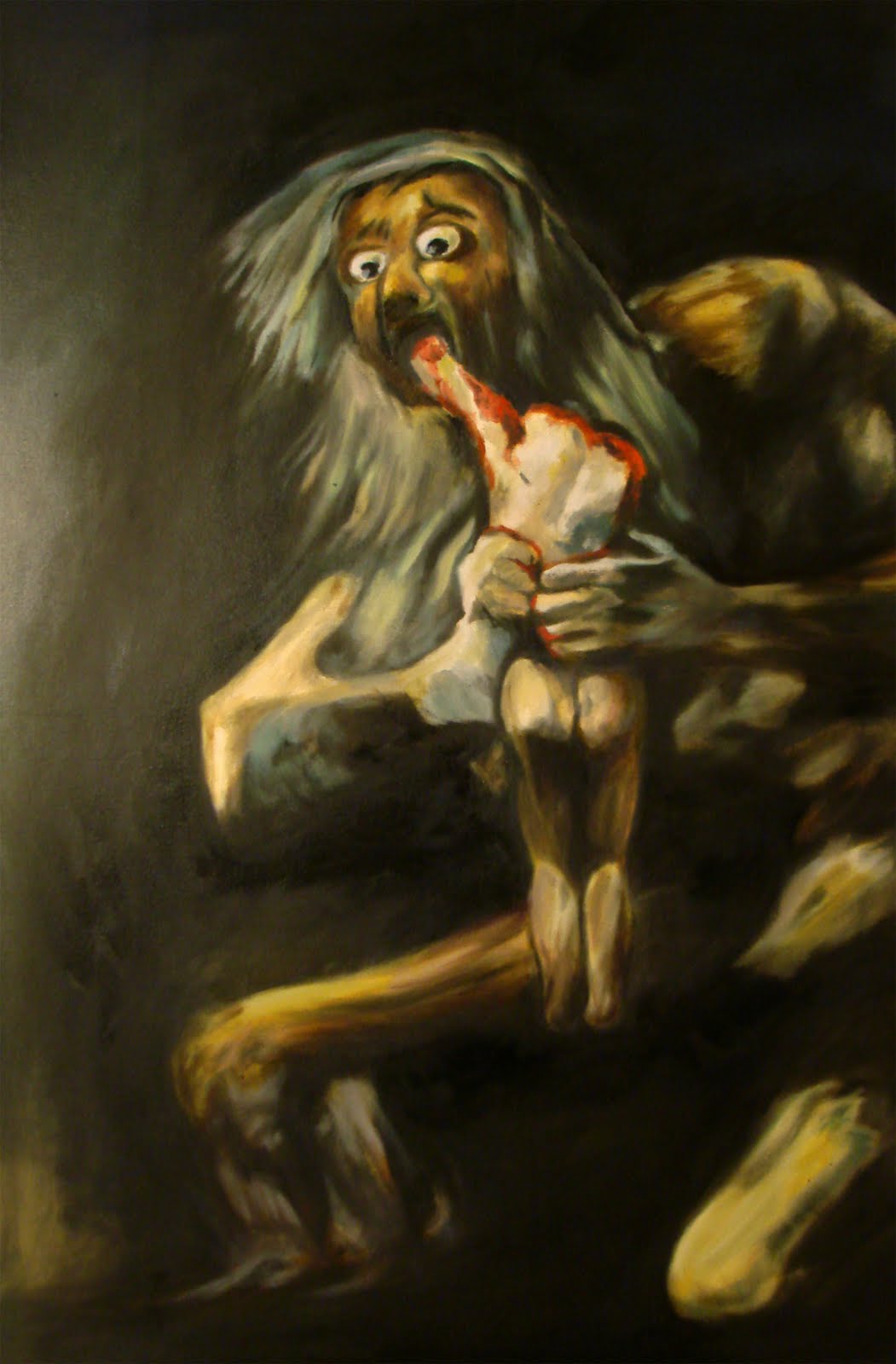
Spanish artist Francisco Goya did that. He clearly depicted the deplorable. I would never hang his painting "Saturn devouring his Son" above the couch in my living room but it is an unspeakably powerful painting. It's his way of saying to the establishment -- "Hey, you are supposed to be protecting the people but instead, you are devouring them and you remind me of THIS!" -- a father devouring his son. Unspeakable, but powerful.

I have no idea if this commission will actually happen but it has affected me already. Can I just be really vulnerable and honest for a moment? See, I love the Jewish people and their history and their God. He has become my God and my faith tradition demands I love and respect these people. The holocaust is a personal affront and it all happened under the noses of people of my own faith tradition. They just let it happen. What do I do with that? I mourn. I mourn. I mourn.

So I think that, yes. I would be honored to use my art and depict horror...and hope. There is beauty in hope as well, right? I hope I get this assignment.

Thoughts on a Mighty Failure

StClaire Art process.jpg

“Anyone who has never made a mistake has never tried anything new.” – Albert Einstein


For the last several months, I've been trying to figure out what to do with a material I love: Dichroic film. It's a vinyl film with an adhesive back and it's usually used on panels of clear plexiglas for interesting effects. I had a few pieces of clear plex and some of the film, so I applied the film to one side of the plex and experimented with applying paint to it, resin to it, ink to it...just to see what happened. 

"What were you thinking you'd do with it?" you ask. Well, I was asking that same question. I had no idea what I wanted to do with it, I just really wanted to play with it. Then I came up with an legit experiment...which would not be cheap (dichroic film is seriously expensive) but I got the okay from Joy so...I ordered a couple yards of the material. What I ended up doing was creating two paintings the panels of which were built angled toward each other (not parallel to the wall) and I created my painting on that angled surface. I built it up with texture, covered the texture with Italian aluminum leaf, oil paint and resin. Then...I covered the surface with the dichroic film. Then I was outside with the pieces and it started to rain. When I got back into my studio, there were big rain drops all over the surface of my cool paintings. I thought they were ruined except now...who'd have guessed? The rain drops amplified the coloration of the dichroic film, creating little circular puddles of rainbow light everywhere they rested on the surface. So that effect was too cool to pass up playing with so...I dried off the surface of the panels and dropped bits of resin all over the surface of each panel. When the resin cured, I had permanent "rain drops" on the surface of my paintings. The effect was cool. 

And then I posted photos on Facebook and waited for some opinions. Putting together the honest input of friends, I realized I was working with a material that was indeed cool and worth experimenting with, but that the way I was using it was entirely overkill. It's like someone getting all excited about inventing vanilla extract and then trying to convince you that it was amazing and you really need to take a big gulp of it. That would end in disaster, as did my art experiment. Vanilla extract (like dichroic film) is very, very potent. You only need a small bit to make a huge impact. 

So it's back to the drawing board. I'm going to do something with this stuff. And I've got some ideas! 

Winston Churchill once said, "“Success is the ability to go from failure to failure without losing your enthusiasm.” Thank you Winston. I am undaunted. 

Of Ruination and Rescue

I'm going to be rather vulnerable here. There's a big part of me that would like to create the impression that as an artist, I always know what I'm doing, but that wouldn't really be true. Most of the time, I do feel very confident with what I paint but then there are times that make me realize I have so much yet to learn. This week, I almost ruined a 4' x 5' painting. 

The oil painting in question is a very large abstract, and as I've explained in past blogs, I am never in complete control of an abstract painting. They really do have a mind of their own. Well, it turns out this painting had self-destructive tendencies I had to deal with. I had thought I was about half done with paint application and I kind of liked where it was going and was having fun working on it. Then two days ago, I was applying paint, a little here, a lot over there, more paint here, scrape off some there, and eventually I stood back and realized I'd just completely ruined the piece. So I was going to let it all dry and then re-cover it all with aluminum leaf and start all over again. 

I felt like God just before the flood, regretting even making this monstrosity. I was ready for the 40 days and 40 nights of deluge and looking forward (though rather defeated feeling) to starting over. 

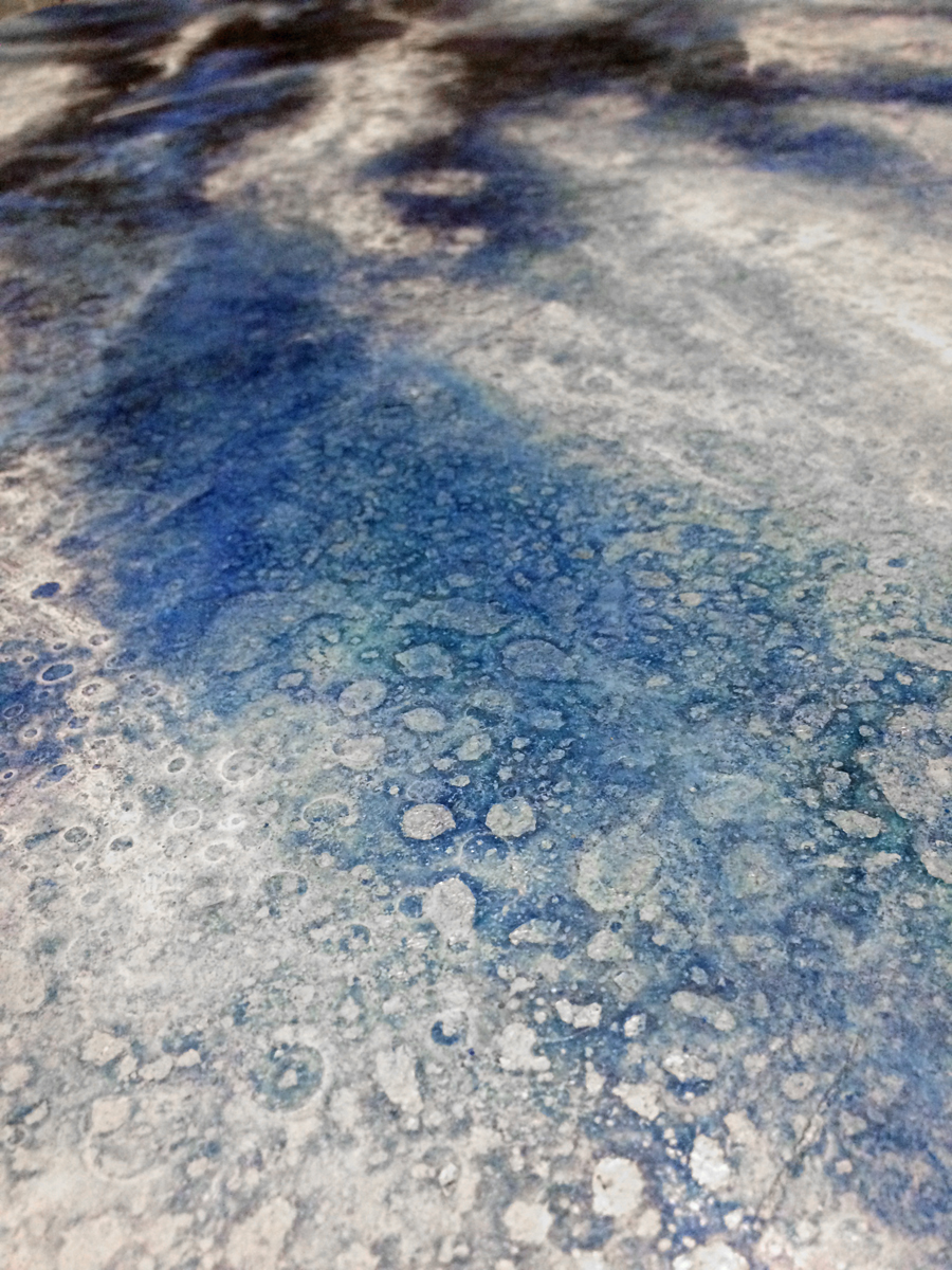
That's when Joy stepped to the back of my studio and took a look at it. "Oh, that's really bad," she whispered. (She's honest like that.) And I said I was going to have to start all over. Then she suggested just wiping off all the paint I had just applied that day and then taking a look at it the next day with fresh eyes. So I did, and something really weird happened. When I wiped off the fresh paint, a little paint film still stuck to the rest of the piece; a fog of blues, greens and whites. Hmmmm. Interesting. That slight film I was unable to remove completely softened the whole thing and brought everything together. 

The next morning I came in and was not repulsed (always a good sign) and was able to completely save the piece. Whew. 

There is a lesson here I think.

How I decide what to paint...

Today is Tuesday (my day off from painting).  By the way, if you're a visitor to Asheville and roaming around the River Arts District, looking for open art studios, never fear. My studio is open and being watched by Ruth Vann, a dear friend of Joy's and mine. So as I was saying, today is my day off and I thought I would spend some time on the computer hunting for photos that inspire me (I am constantly on the look-out for a photo or an idea that would lead to a compelling oil painting).

But...what makes a "compelling" oil painting? Glad you asked, but that's a tough question to answer!  When you go to Google images for instance and type in "compelling landscape photos", you get some very nice photography. But I can literally spend an hour looking at hundreds and hundreds of beautiful photos and not one of them would make a really great oil painting. Why is that?

One sticking point that causes most photos to be disregarded is that I'm looking for a subject matter (for the most part) that is either generic or is specific to Western North Carolina. That is because I have found it difficult to sell artwork that is obviously a scene from somewhere else in the country. About three years ago, I came up with what I thought was a really great idea:  to paint the iconic scenes from around the whole country. My thought was that people come into my art studio from all over the country so...why just stick to local North Carolina landscape scenes? Well, that year I had a blast painting Mt. Rainier, Yosemite Valley, the plains of Nebraska, the coast of Maine and the bayous of Louisiana. I loved it. This country is huge and so incredibly scenic. Great idea, huh?

Well no. I still have a few of those paintings left. I learned something that year though. Most of my paintings I sell in my studio are to people visiting Asheville, and they're looking for something to take home to remind them of their time in Western North Carolina (not a lighthouse on the coast of Maine). So now, that's the first thing I look for: something specific to North Carolina mountains and woods, or something generic (mountains, trees, lakes, rivers etc. that could be anywhere).

But then the second thing I look for in a photo I use for inspiring a painting is whether or not it "draws you in". That is what I am looking for and I'm not really sure what does that. Lighting? Colors? Contrast? All the above? Something else? Basically, I want each painting to speak to the viewer : "come home". That's it. It's that simple. Come home. We strive and work and stress-out and play and vacation so that we can re-create Eden. We really do. I don't care what religion you are, I think that's what we're all doing. We long for paradise and try hard to create. I can't create paradise, but I can let the viewer look at it. And I like that. I believe that hints at hope. This very easily turns into a philosophical and spiritual conversation, and I won't do that here but...that really does explain what I'm trying to do with my artwork and what I'm inspired by.

A Trip to the Art Museum

Have you ever felt intimidation stepping into an art gallery? Have you been to a modern art museum and felt like a cultural moron, stuck wondering, “why is this oil painting even in here, and who decided this is art?” If your answer is ‘yes’ to either question, read on.

I’ve heard people say things like “with art, there are no mistakes. It’s all art” (and this assertion is ridiculous). You see, contrary to the opinion of those who esteem themselves as culturally elite postmoderns, art has rules. Don’t get me wrong…you can haphazardly throw paint on a canvas and it may be great therapy, but it’s not necessarily great art.

Think about it...

Consider, we don’t approach any other creative endeavor with the assumption that “there are no rules – there are no mistakes!” Can I record myself pounding on a piano and expect to go platinum? Can I string together 50 random words from Webster’s dictionary call that poetry? Can I close my eyes, dig through my refrigerator, pull out great gobs of mystery contents, whip up something special on the stove, and call that cooking? It may be special but not likely edible. And that’s because music has rules and poetry has rules and cooking has rules and if you break those rules you have a mess. It should be no surprise then that creating artwork is exactly the same way.

Rules can be our friends...

There are rules and it takes time and painstaking work to master these rules. But with mastery, they can form an incubator for truly great artwork. Let me be honest. I don’t think everything heralded as art is truly art. I think a great deal of confusion happens when we don’t make a distinction between “art” and “visual expression”. Visual expression does not have to conform to any rules at all. It can be shocking. It can be crude. It can be poorly executed. It doesn’t matter. Visual expression needs only to say something and make you think (e.g. graffiti spray painted on a wall to incite rebellion or express angst).  The confusion arises when visual expression winds up in art museums. Don’t let that intimidate or confuse you. It may be a powerful visual expression, and it may be valid. Please listen to it. Try to understand what it means. Maybe it is completely inane and nonsensical (but maybe that’s how its creator views their world, so it can still be insightful). But you don’t have to process someone’s visual expression like you would process true art. Visual expression seeks to communicate, but without reference to the rules of design and beauty. I believe true art recognizes the rules and design within the universe and works within the grain of these patterns to create something beautiful and emotive.

Art has rules and structure. Those rules and that structure provide a framework for for the creation of something truly amazing.

"The Rules" of Art

Art: The Process of Creating an Oil Painting

I recall an episode of Downton Abby where a certain gentleman made a glaring fashion blunder by wearing a white tuxedo vest. Obviously, he should have known better—should have known to wear the black vest. The family was scandalized and horribly embarrassed for him. I can only imagine.

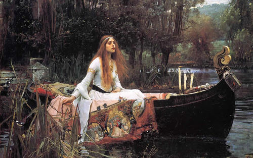
Rules that dictate behavior in “high society” are often comical, and it’s easy to question their validity at all. Aren’t norms arbitrary and man-made? If society banded together, we could all just as well decide that it’s proper to wear orange vests to our dinner parties, and then that would be the right choice, right? The truth is, some rules are like that. And some aren’t. Some rules are really more conventions than rules. But the rules I want to proceed to discuss here – the rules of art, are far from arbitrary or man-made. We artists take our cue from nature itself. Nature – the way things work, the way things are put together – is what dictates the standards for beauty. I’d like you to study this photo:

This is a oil painting by John William Waterhouse entitled “The Lady of Shalott”. Look at the painting and notice where your eyes are led and where they rest. Are you haplessly scanning the piece, with nowhere for your eyes to land? Probably not. If you’re like most people, your eyes will immediately fall on the face, and then wander to the golden prow of the boat, and then follow the gentle curve of said boat, up the figure to rest once again at the girl's face. Your eye does this for a reason. The painter, John William Waterhouse, used a device called the Golden Section when he composed this piece. The Golden Section (also known as the Golden Ratio or the Divine Proportion) is an almost magical ratio. Mathematically, it is the ratio 62:38. This ratio is found all over nature, all over art, all over everything we deem beautiful. The Golden Section is the most aesthetically pleasing division of space. Looking up at the above photo again, start at the right side and trace your eyes over 62% of the way to the left. That point corresponds to the placement of the woman’s face. Start from the bottom of the photo and measure out 62% and you’ll find your eyes again stop at the woman’s face. Your eyes naturally fall on her because they are carried there by this intersection of two very important mathematical divisions. But there is another reason your eyes are drawn to rest upon the woman’s head. Waterhouse employed not only the Golden Section in the composition of his piece but also his knowledge of contrast. Your eye will always travel to where the lightest light and the darkest dark meet. There is a reason the Lady is wearing white and the sun is shining bright on the top of her head: this creates the point of greatest contrast in the painting against the dark background of the trees. The result is that your eyes are not scrambling but resting naturally at the exact point the artist predetermined to draw them.   I might also mention the use of complementary colors in this painting. Complementary colors are opposites on the color wheel and a complementary color is used to either balance the predominate color or to accent it. Look at the painting again. The predominant colors in this piece are muted greens but he also uses the complement of muted reds. In the water we see blues and violets and that is complemented with the golds and yellows. All this to say: this painting was not haphazardly assembled. Waterhouse worked within The Rules and created a masterpiece.  

...Good art is that it is always created with skill

The last thing I’ll say about good art is that it is always created with skill. There should be somewhat of a mystery about it. When standing in front of a beautifully painted piece of art you should be prompted to awe and wonder, asking the question, “how did he or she do that?” To be honest, much of the artwork in modern times leaves me asking no such question. There is no mystery and no obvious skill. Such art neither commands my respect nor holds my interest. Art that will be remembered throughout history is not that which ignores the rules, nor that which becomes tirelessly bogged down with the rules. No, art that lasts will be that which so internalizes the rules that it moves beyond them, synthesizing and remixing them into new focal points of beauty—new reinventions of that created order which was there from the beginning, but which is inexhaustible in its number of true expressions.