
Art Blog
This blog is for posting photos of new artwork and for the expression of sometimes random thoughts of oil painter Stephen St. Claire.
Conversations Across Time: Caravaggio
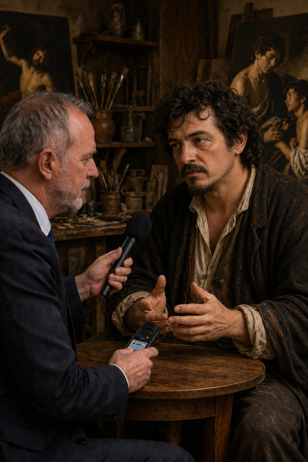
An ongoing series at stclaireart.com in which we imagine sitting down with the greatest artists in history.
This interview was interesting. This gentleman arrived looking like a man who has not slept well in years. He sat with his back to the wall, facing the door, and surveyed the room with the particular alertness of someone who has learned to be careful. It is 2026, though he does not seem entirely surprised to be here.
Me: I'll be honest — I wasn't sure you'd agree to this.
Caravaggio: (A short, hard laugh.) I have nothing but time at the moment. And I find I am tired of my own company. Ask your questions.
Me: You changed painting forever — the darkness, the light, the ordinary people pulled in from the streets to play saints and apostles. Where did that come from?
Caravaggio: From looking. From actually looking at the world rather than at other paintings. When I arrived in Rome every painter was painting other painters. Raphael painting Raphael painting Raphael. Beautiful, yes. True? No. I went into the streets. I found a prostitute and I painted her as the Virgin Mary. I found a peasant with dirty feet and I painted him as Saint Matthew. The Church was not always pleased.
Me: That's putting it mildly.
Caravaggio: (Drily.) They rejected the painting. Twice, in one case. But they always came back. Because people stood in front of those paintings and recognized something. They saw themselves. They saw their mothers, their neighbors, their own hands. That had not happened before, not like that. You cannot reject that forever, no matter how uncomfortable it makes you.
Me: The darkness in your work — the dramatic shadows, the figures emerging from almost pure black. Was that a technical choice or something more personal?
(A long pause. He looks at his hands.)
Caravaggio: Both. Always both. I understood very early that light means nothing without darkness. A face fully lit is a face with nowhere to hide. But catch it half in shadow and suddenly there is mystery — there is an interior life, something the viewer has to complete themselves. That is where the drama lives. In what you cannot quite see.
Me: Some people have suggested the darkness reflected your own psychology.
Caravaggio: Some people should paint their own pictures and leave mine alone. He paused. But they are not entirely wrong.
Me: You killed a man. In a brawl in Rome in 1606. You've been running ever since. Does it follow you into the work?
Caravaggio: Everything follows me into the work. That is both the gift and the punishment of being a painter. You cannot separate what you have lived from what you make. After Rome — after the killing — the paintings got darker. More desperate. More — I don't know the word. More aware of how quickly it can end. Look at the late work. Look at the David with the Head of Goliath. That is my own face on Goliath's severed head. I painted myself as the monster. As the defeated thing. Make of that what you will.
Me: That's an extraordinary act of self-examination.
Caravaggio: Or self-punishment. I have never been entirely sure which.
Me: What do think critics and historians get most wrong about you?
Caravaggio: They make the life the story and forget the work. Yes, I was violent. Yes, I fled Rome. Yes, I spent time in prison more than once. These things are true and I do not deny them. But I did not change the history of painting by being violent. I changed it by working. By getting up every morning — or every afternoon, I was never an early riser — and standing in front of a canvas and solving problems that no one had solved before. The life makes a good story. The work is the actual point.
Me: If you had one day in the present — our world, right now — what would you do first?
I want to see what became of the light. Photography, cinema — I have heard about these things. Capturing light on a surface, freezing a moment. (Something shifts in his face.) That is what I was trying to do. With paint, with a candle, in a dark room. I want to see if they understood what they were doing — if they knew they were continuing something that started in my studio in Rome.
Me: I think some of them knew exactly that.
Caravaggio: (Quietly, and with what might be satisfaction.) Good.
Me: And lastly, what would you say art is actually for?
Caravaggio: To show people what they are actually looking at. Not what they think they see — what is really there. A saint is a human being who was afraid and went forward anyway. A sinner is a human being who made a choice in a bad moment. I painted both with the same faces because they are the same people. Art strips away the comfortable story and shows you the truth underneath. That is not always a pleasant experience. It was never meant to be.
Michelangelo Merisi da Caravaggio (1571–1610) was an Italian painter whose revolutionary use of dramatic light and shadow — chiaroscuro — and his insistence on gritty, unidealized realism transformed Western painting and gave birth to the Baroque. Volatile, violent, and perpetually in trouble with the law, he spent the last years of his life in exile, dying under mysterious circumstances at thirty-eight, a papal pardon reportedly just days away. His best known works includeThe Calling of Saint Matthew, the Judith Beheading Holofernes, and David with the Head of Goliath.
This is an imagined interview. Caravaggio's responses are constructed from historical research, contemporary accounts of his personality and documented life events, and close study of his body of work. No direct quotes are presented as real.
No deceased artists were harmed in the making of this series.
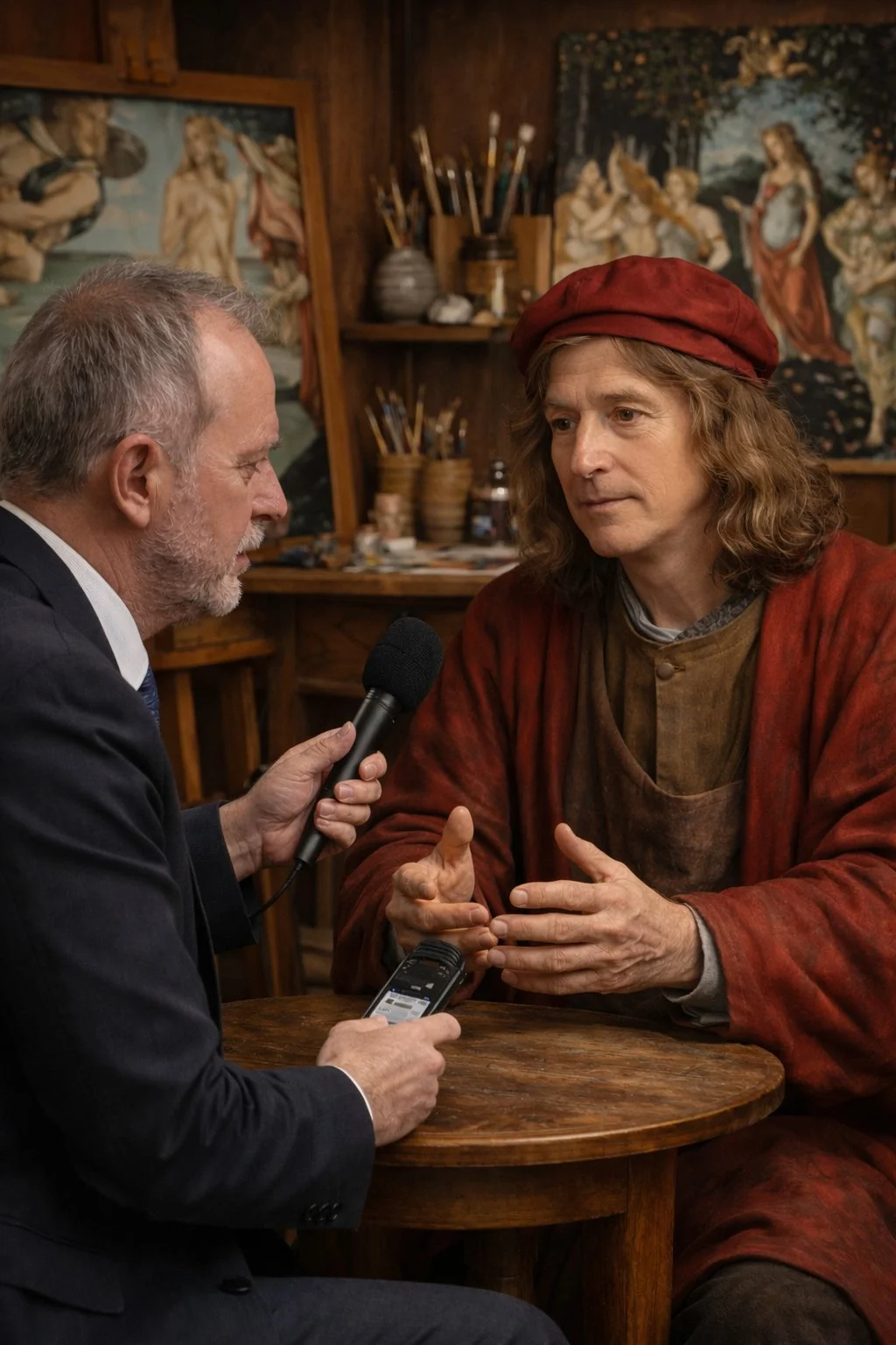
Conversations Across Time: Raphael
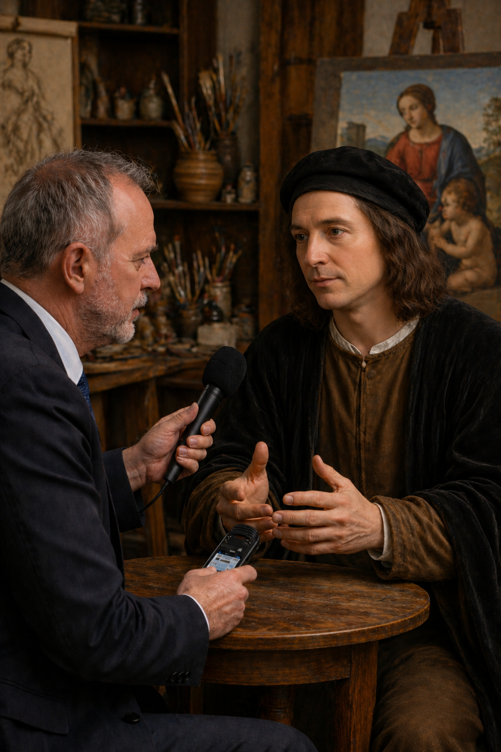
An ongoing series at stclaireart.com in which we imagine sitting down with the greatest artists in history.
When I set up this interview, I was invited to meet in Rome, in a studio that felt less like a workplace and more like a gathering place — assistants moving quietly in the background, light pouring through high windows. The master stood to greet me before I even sat down. He is younger looking than I expected.
Me: You're more relaxed than the last few people I've sat with in this series.
Raphael: (Laughing.) Who have you been talking to? Michelangelo?
Me: Among others.
Raphael: Then I am not surprised. Sit down. Can I offer you anything?
Me: You died at thirty-seven. In those thirty-seven years you produced a body of work that most artists couldn't match in a hundred. Did you have some sense that time was short?
Raphael: I had a sense that there was always more to do than time allowed. Whether I knew how little time I had — no. I don't think any of us knows that. But I worked quickly because I loved working. It was not anxiety that drove me. It was appetite. Every commission was a new problem, a new room, a new surface, a new set of ideas to wrestle with. I found that — I find that — I cannot think of anything I would rather be doing.
Me: Even now, knowing how it ends at thirty-seven?
Raphael: (A pause, something flickering across his face.) Even now. The work was the life. The life was the work. I have no complaints about what I was given.
Me: You were a student of Perugino, and then you came to Florence and encountered Leonardo and Michelangelo. That must have been like walking into a thunderstorm.
Raphael: That is exactly what it was. I arrived thinking I knew something — Perugino had taught me well, I was already receiving commissions — and then I saw what Leonardo was doing with shadow, what Michelangelo was doing with the human form, and I understood very quickly that I needed to start over.
Me: That kind of humility is rare, sir.
Raphael: It was not humility. It was clarity. There is no point in pretending you are further along than you are. I looked at the cartoon for the Battle of Anghiari and I thought — I cannot do that yet. So I learned how. A painter who cannot be changed by what he sees has stopped growing. I never wanted to stop growing.
Me: What do critics and historians get most wrong about you?
Raphael: That I was somehow easier than the others. Smoother. More decorative. As if grace and harmony are lesser achievements than struggle and torment. Michelangelo suffered visibly and so people decided his work must be deeper. I made it look effortless and so people decided it must have been. Neither is true, of course. The School of Athens alone — the architecture, the fifty-eight figures, each one a specific philosopher with a specific gesture and a specific relationship to every other figure in the room — that did not happen effortlessly. I simply did not see the point of making my difficulties your problem.
Me: That might be the most elegant thing anyone has said to me in this series.
Raphael: (Smiling.) I have had practice.
Me: You were enormously charming, socially gifted, beloved by popes and patrons alike. Was any of it an act?
Raphael: All of it and none of it. I genuinely liked people. I was genuinely interested in them. But I also understood very early that a painter who cannot get along with his patrons is a painter who does not work, and a painter who does not work is simply a person with ideas that go nowhere. The charm was real. The usefulness of the charm was also real. I saw no contradiction there.
Me: If you had one day in the present — our world, right now — what would you do first?
Raphael: I would go to the Vatican and stand in the Stanza della Segnatura and look at the School of Athens for as long as they would let me. I want to see it with modern eyes — with the distance of five hundred years. When you are inside the making of something you cannot see it whole. I never could. I want to finally see it whole.
Me: It is considered one of the greatest paintings ever made.
Raphael: (Quietly, and without vanity.) I know. I just want to see it for myself.
Me: And finally…What is art actually for?
Raphael: Interesting question. I think, art is for bringing people together around something larger than themselves. Look at the School of Athens — Plato and Aristotle at the center, every great mind of antiquity gathered in one imagined space, in conversation, in disagreement, in the shared pursuit of understanding. That is what art does at its best. It creates a room that everyone can enter. It says — here are the best things human beings have thought and felt and made. Come in. Sit down. You belong here too.
Raffaello Sanzio da Urbino (1483–1520), known as Raphael, was an Italian painter and architect of the High Renaissance whose work is celebrated for its clarity, grace, and visual achievement of the Neoplatonic ideal of human grandeur. Alongside Leonardo and Michelangelo he forms the triumvirate of the great masters of that period. He died in Rome on his 37th birthday, widely mourned. His best known works include The School of Athens and the Sistine Madonna.
This is an imagined interview. Raphael's responses are constructed from historical research, contemporary accounts of his personality and working methods, and close study of his life and work. No direct quotes are presented as real.
No deceased artists were harmed in the making of this series.
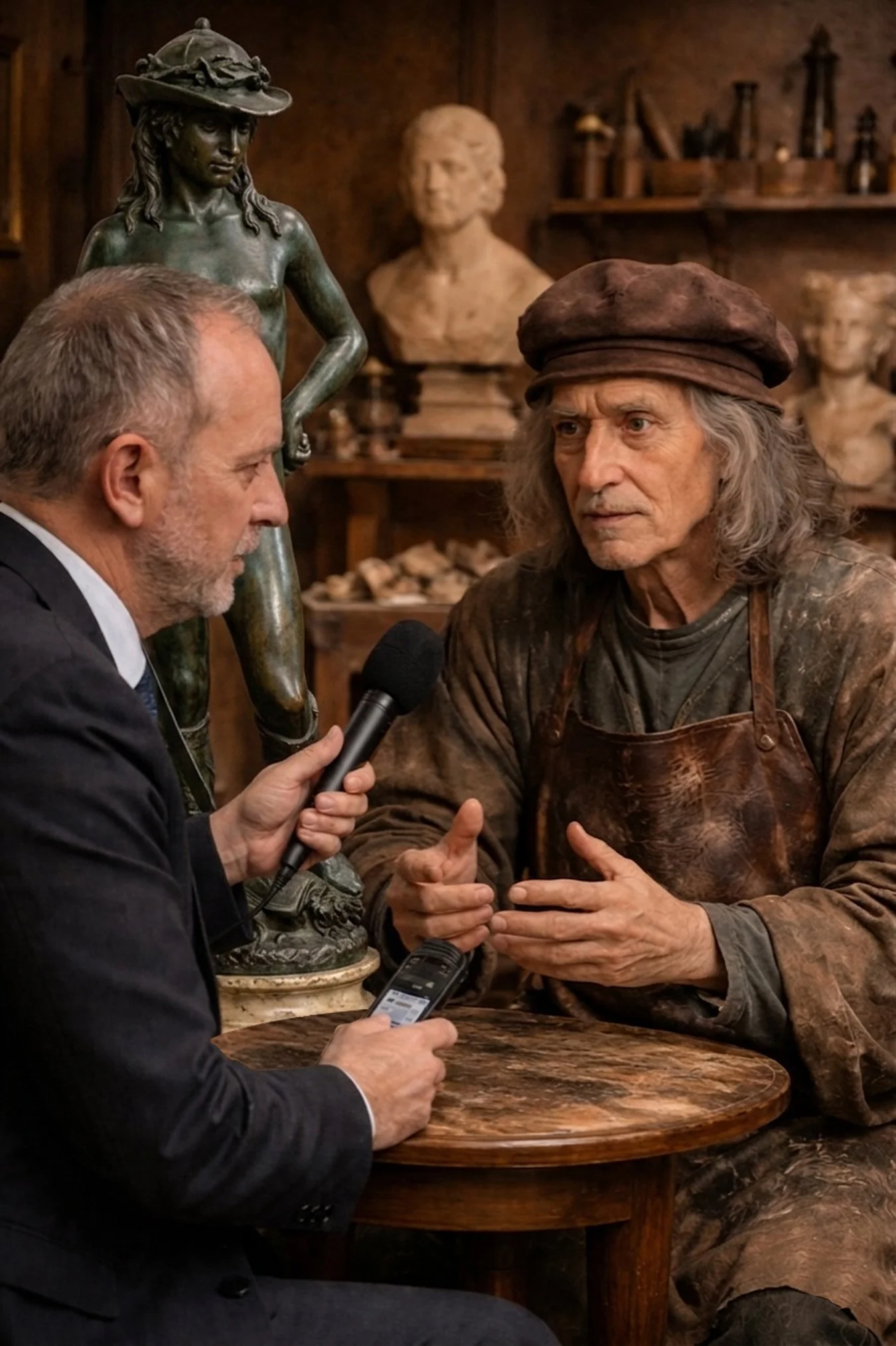
Conversations Across Time: Michelangelo
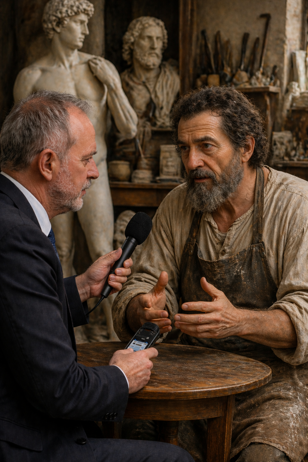
An ongoing series at stclaireart.com in which we imagine sitting down with the greatest artists in history.
Me: We're sitting in your studio in Rome. There is marble dust on everything, including you. You've been working this morning already.
Michelangelo: I am always working. Ask your questions.
Me: I will do that. First of all, you are perhaps the only artist in history who was called "divine" during his own lifetime. How did you carry that?
Michelangelo: Badly, I think. (He says this without humor.) It is a dangerous thing to be told you are divine when you are also a man who sleeps poorly and quarrels with his patrons and worries about money. The gap between what people believed I was and what I knew myself to be — that gap was not comfortable to live inside. I was not divine. I was someone who worked. I could not stop working even when it was killing me.
Me: And it nearly did, several times.
Michelangelo: The Sistine ceiling alone — four years on my back, the paint dripping into my eyes, my neck so damaged I could not hold my head straight for months afterward. Pope Julius would bang on the door and demand to know when it would be finished. I wanted to throw him from the scaffolding on more than one occasion.
Me: I'd have paid to see that.
Michelangelo: (The ghost of a smile.) So would I.
Me: You always insisted you were a sculptor first, not a painter. Yet the Sistine Chapel ceiling is arguably the most famous painted surface in the world. Does that irk you?
Michelangelo: Irk is too small a word. I was given a ceiling and told to paint apostles in the corners. Apostles in the corners! I looked at that ceiling and I saw — everything. The whole story of man and God and creation and failure and redemption. So I painted everything. And now people come from every corner of the earth to lie on their backs and look up and they do not know — they cannot know — what it cost.
Me: What did it cost?
Michelangelo: (A long pause.) I wrote a poem about it at the time. About my body twisted and ruined, paint falling on my face like a floor. I meant it as a complaint. People now read it as a testament. (Drily.) That seems about right.
Me: What do critics and historians get most wrong about you?
Michelangelo: They romanticize the suffering. They think the torment was the source of the genius — that I had to be miserable to make beautiful things. This is nonsense. I was miserable because the work was hard and the patrons were difficult and the marble was sometimes wrong and the human body refused to do what I asked of it. The suffering was not the point. The work was the point. I would have preferred to be happy and make the same things. I was simply not given that option.
Me: Were you ever happy?
Michelangelo: (He thinks about this with what seems like genuine effort.) There were moments inside the work. When something resolved — when a figure finally did what I had been trying to make it do for weeks — there was something in that. Not happiness exactly. Relief, perhaps. The relief of a problem solved.
Me: The Pietà — you made it when you were twenty-four years old. Twenty-four. How?
Michelangelo: I had been looking at it my whole life. Every pietà I had ever seen was wrong — the Virgin too old, too grief-stricken, the composition fighting itself. I knew what it should be before I touched the marble. Mary had to be young — ageless, really. Grief of that magnitude does not age a person. It suspends them. And Christ had to lie across her with the full weight of what had been lost — not the weight of a body, but the weight of the world. The marble told me the rest.
Me: "The marble told you." You've said that before — that the figure already exists inside the stone.
Michelangelo: It is not mysticism. It is attention. You look at the block long enough, you see where it wants to go. The sculptor's job is simply to remove what does not belong.
Me: If you had one day in the present — our world, right now — what would you do first?
Michelangelo: I would go to Disneyland. Hah! Just kidding. I would definitely go to the Accademia in Florence and stand before the David for as long as they would allow me. Not out of vanity — I want to see what time has done to him. Whether he still holds. Whether the tension in the shoulders reads the way I intended across five hundred years.
Me: He still stops people in their tracks.
Michelangelo: (Quietly, as if to himself.) Good. He should. He is about to do something terrifying and he knows it and he is going to do it anyway. That is the whole of it. That is what I put into the marble.
Me: What is art actually for?
To close the distance between the human and the divine. I do not mean this in a soft or decorative sense. I mean it literally. We are imperfect creatures living imperfect lives and we sense — we cannot help but sense — that there is something larger than us, something that does not decay the way we decay. Art is the attempt to touch that thing. To make something that participates in permanence even briefly. The Sistine ceiling will outlast everyone who has ever stood beneath it. That is not nothing. That is, in fact, almost everything.
Michelangelo di Lodovico Buonarroti Simoni (1475–1564) was a Florentine sculptor, painter, architect, and poet widely considered one of the greatest artists of all time. Fiercely devout, famously difficult, and relentlessly prolific, he worked into his eighties and left behind a body of work that remains without parallel. His best known works include the Pietà, theDavid, and the ceiling of the Sistine Chapel in Rome.
This is an imagined interview. Michelangelo's responses are constructed from historical research, his own surviving letters and poems, and contemporary accounts of his life and personality. No direct quotes are presented as real.
No deceased artists were harmed in the making of this series.
Conversations Across Time: Sandro Botticelli
An ongoing series at stclaireart.com in which we imagine sitting down with the greatest artists in history.
Me: Master Botticelli, it is truly and honor to meet you. Thank you for your time. To begin with, I wanted to ask you about your painting “The Birth of Venus”. That piecewas considered scandalous when it was made — a life-sized goddess with nothing between her and the viewer but paint and air, the first such figure on that scale since antiquity.
Botticelli: Nervous is not quite the word. I was aware that I was doing something that had not been done for a very long time. But the Medici understood what I was trying to say. Lorenzo and his circle — they believed that beauty itself was a form of truth, that the ancient world had something to teach us about the divine that the Church had not entirely captured. Venus rising from the sea is not a pagan provocation. She is an idea. The arrival of beauty into the world. The soul descending into matter.
Me: That's a very philosophical defense of painting a gorgeous woman with nothing left to the imagination.
Botticelli: (Laughing softly.) Yes, well. Philosophy and beauty have always gotten along rather well.
Me: You were deeply connected to the Medici family and their circle of humanist philosophers. How much did that world shape what you painted?
Botticelli: Entirely. I cannot overstate it. Marsilio Ficino, Poliziano — these were men who spent their lives thinking about Plato, about the nature of love and beauty and the soul. I sat with them, listened to them, argued with them over dinner. When I painted Primavera — the three Graces, Mercury, Flora — I was painting their conversations. Their ideas given flesh and color and movement. Without the Medici I would have painted Madonnas for churches my whole life. They gave me permission to imagine a larger world.
Me: Do you think that was a gift or a complication?
Botticelli: (A pause.) Both. Always both.
Me: What would you say that critics and historians probably get most wrong about you?
Botticelli: They divide my life in two — the early Botticelli, full of beauty and mythology and light, and the later Botticelli, dark and religious and haunted. As if I became a different person. But I did not become a different person. The world became a different place. When Savonarola came, when Lorenzo died, when the bonfire of the vanities consumed so much of what we had made and loved — you could not simply continue painting spring goddesses as if none of that had happened. My later work is not a retreat. It is an honest response to loss.
Me: You reportedly burned some of your own paintings in Savonarola's bonfires.
Botticelli: (Quietly.) I was afraid. And I believed, for a time. I am not proud of the fear. The belief — that I understand better now, from a distance. But the fear I regret.
Me: The faces in your paintings — Venus, the Madonna, the Graces — they all share a certain quality. A kind of wistful melancholy even in moments of beauty. Was that deliberate?
Botticelli: I think beauty without some sadness in it is not entirely trustworthy. A face that is only happy is a face that has not yet understood what it means to be alive. The women I painted — they are beautiful, yes, but they are also aware of something. Some knowledge just at the edge of their expression. I could not paint innocence without also painting its fragility.
Me: Some people believe you were in love with Simonetta Vespucci — the woman thought to be the model for Venus. Were you?
Botticelli: (A long silence.) She was — there are some things a painter puts into his work precisely because he cannot put them anywhere else.
Me: That might be the most romantic answer I've ever received.
Botticelli: (Simply, without drama.) She died at twenty-three. I asked to be buried at her feet. Draw your own conclusions.
Me: If you had one day in the present — our world, right now — what would you do first?
Botticelli: I want to see what became of Florence. I know it is still there — I have heard it described. But I want to walk across the Ponte Vecchio and see if it still smells the same in the morning. I want to see whether the light on the Arno is as I remember it.
Me: I think you'd find it remarkably unchanged in some ways.
Botticelli: (Something in his face softens.) Good. Some things should be allowed to stay.
Me: And last question…What is art actually for?
Botticelli: I think the main goal of the artist is to make the invisible visible. Love, longing, the presence of the divine, the passing of time — none of these things have a shape you can point to. But a painting can give them a shape. When people stand before The Birth of Venus and feel something they cannot name — that nameless thing is the point. I was not painting a woman emerging from a shell. I was painting the moment beauty enters a life and changes it forever. If even one person has stood before that canvas and felt that — felt it in their body, not just understood it in their mind — then the painting has done what I asked of it.
Sandro Botticelli (1445–1510) was a Florentine painter of the early Renaissance, celebrated for his lyrical mythological works and his luminous Madonnas. A favorite of the Medici family, he moved in the most sophisticated intellectual circles of his age. In later life, under the influence of the fiery preacher Savonarola, he turned away from mythology toward intensely devotional religious work. His best known paintings include The Birth of Venus and Primavera.
This is an imagined interview. Botticelli's responses are constructed from historical research, contemporary accounts, and close study of his life and work. No direct quotes are presented as real.
No deceased artists were harmed in the making of this series.
Conversations Across Time: Donatello
An ongoing series at stclaireart.com in which we imagine sitting down with the greatest artists in history.
Me: Sir, you are considered the first great sculptor of the Renaissance — the man who essentially brought sculpture back to life after centuries of medieval stiffness. That's an enormous thing to be credited with. Does it feel accurate?
Donatello: I did not think of it in those terms while I was working. I thought of it as — the figures in the churches looked like they were waiting for something. Standing there, rigid, symbolic, patient. But people are not like that. People lean. People turn to look at something over their shoulder. People carry weight in their bodies — grief, pride, exhaustion. I wanted to make figures that had clearly just moved, or were about to.
Me: As if you'd caught them mid-thought.
Donatello: Yes. Exactly that. Stone should not look like it is pretending to be alive. It should look like it was alive, just a moment ago.
Me: Your David was the first free-standing bronze sculpture since antiquity. That must have felt like an act of some courage — or perhaps defiance?
(He considers this with a slight tilt of the head.)
Donatello: Courage implies I was afraid. I was not afraid. I was — impatient. The human body is the most extraordinary structure in existence. Every muscle has a reason. Every gesture tells a story. To swathe all of that in heavy cloth, to hide the figure beneath layers of fabric and piety and frozen expression — it felt like a kind of lie. The Greeks understood that the unadorned form was not shameful but revelatory. I simply remembered what they knew.
Me: You simply remembered. Hah! You make it sound effortless.
Donatello: Well…It was not effortless. The bronze alone nearly killed me. I mean that in a practical sense — the casting, the heat, the fumes. But no, it was not effortless.
Me: If I may ask, what do critics and historians get most wrong about you?
Donatello: They place me in a line — before Michelangelo, before Raphael — as if I am a stepping stone to something else. A precursor. Well, no disrespect to either Michelangelo or Raphael but I was not working toward someone else's destination. I was working toward my own. The Magdalene — the wooden Magdalene I made near the end of my life — that is not a precursor to anything. That is a very old man looking very directly at suffering and not flinching.
Me: That piece is devastating. She looks almost destroyed.
Donatello: She had been destroyed. That is the point. Beauty was gone. Faith had cost her everything. I was not interested in making her pretty. I was interested in making her true.
Me: You worked in marble, bronze, wood, terracotta — you were endlessly restless in your materials. Was there one you loved above the others?
Donatello: Bronze. Always bronze. Marble is noble but it is cold and it is unforgiving — one wrong stroke and you have lost everything. Bronze lets you think in a different way. You build it up, you work in wax first, you can change your mind. And when it is finished it holds light in a way nothing else does. It breathes differently depending on the hour of the day.
Me: You sound like you're describing a person.
Donatello: (A pause. Then, quietly.) Yes. I suppose I do.
Me: If you had one day in the present — our world, right now — what would you do first?
Donatello: I would go to a place where they make things with metal. A factory, perhaps, or whatever you call them now. I want to see what tools exist. I spent half my life fighting my materials — the limitations of what a chisel could do, what fire could do. I want to know what I could have made with better instruments.
Me: And after that?
Donatello: (Without hesitation.) I would find the Magdalene and sit with her for a while. She is in Florence still?
Me: She is. In the Museo dell'Opera del Duomo.
Donatello: Good. She should stay in Florence. Some things belong where they were made.
Me: One last question for you…What, would you say, is art actually for?
Donatello: To tell the truth about what it feels like to be alive. Not what it looks like — anyone can describe what something looks like. But what it feels like. The weight of a decision. The way the body carries sorrow differently than it carries joy. I was never interested in ideals. I was interested in specifics. This man, this moment, this particular kind of pain or pride or tenderness. If a sculpture makes you feel something you have not felt before — or feel something you have felt but never seen reflected back at you — then it has done its work.
Donatello (c. 1386–1466) was a Florentine sculptor widely regarded as the greatest sculptor of the fifteenth century and one of the founding figures of the Renaissance. Working in marble, bronze, wood, and terracotta, he revolutionized European sculpture by reintroducing naturalism, psychological depth, and the free-standing nude. His best known works include David, the first free-standing nude bronze since antiquity, and the wooden Mary Magdalene, one of the most emotionally raw works of the Renaissance.
This is an imagined interview. Donatello's responses are constructed from historical research, contemporary accounts, and close study of his body of work. No direct quotes are presented as real.
No deceased artists were harmed in the making of this series.
Conversations Across Time: Jan van Eyck
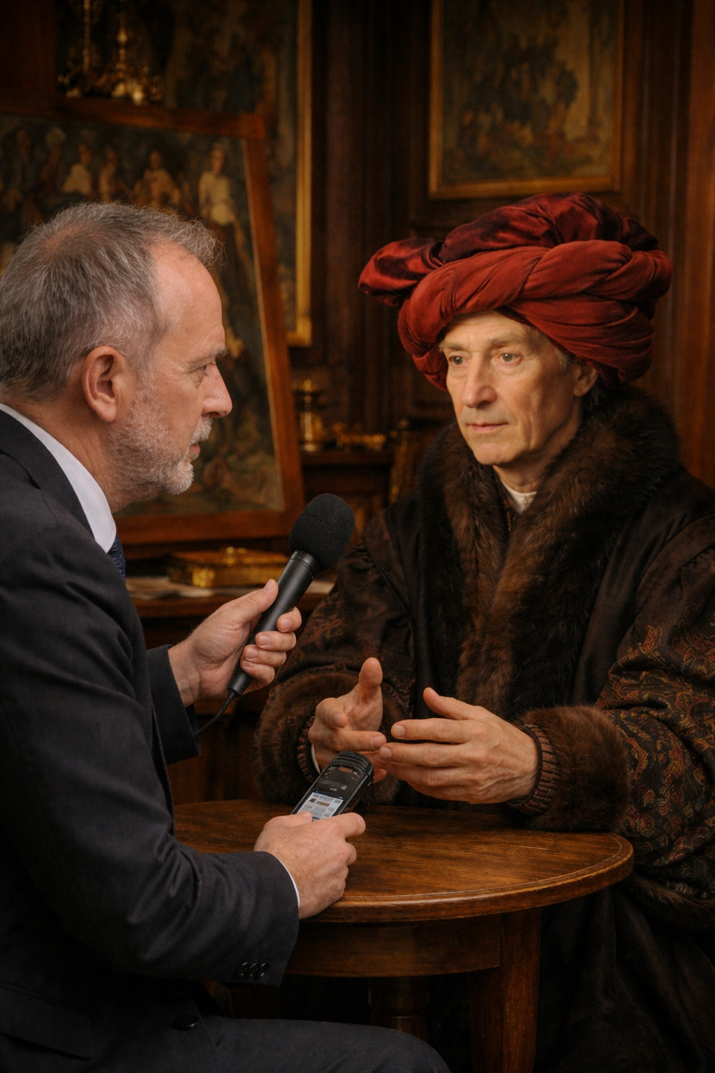
An ongoing series at stclaireart.com in which we imagine sitting down with the greatest artists in history.
Me: Master van Eyck, you are considered the father of oil painting — a technique so revolutionary it changed everything that came after you. Did you know at the time what you were doing?
Jan: I knew that I could see things I could not yet paint. That is where it begins, always — the frustration between the eye and the hand. Tempera was honest but limited. It dried before you could think. Oil gave me time. It gave me depth. You could build it in layers, like glass laid over glass, and the light would travel down through all of it and come back changed.
Me: Like looking into something rather than at it.
Jan: Precisely. A tempera painting sits on the surface. Oil painting pulls you in. I wanted the fur on a collar to feel cold. I wanted a jewel to hold actual light inside it. Whether anyone called it revolutionary was not my concern. I had problems to solve.
Me: Your paintings are filled with almost impossibly small details — inscriptions on rings, reflections in convex mirrors, individual hairs. Was that devotion, or something closer to obsession?
(A quiet pause. He seems to consider the difference carefully.)
Jan: I am not sure those are different things. When I painted the Ghent Altarpiece, there are figures in the distance — pilgrims, barely the size of a thumb — and I painted the creases in their robes. No one was meant to see that. No one could see that, with the naked eye.
Me: Then why do it?
Jan: Because God could see it. I was not making paintings for rooms. I was making them as a form of — I suppose you might call it testimony. That this world, this specific world, with its textures and its light and its particular beauty, existed and was worth recording exactly as it was. Every thread in every carpet. Every vein in every hand.
Me: What do critics and historians get most wrong about you?
Jan: They call me a craftsman first and an artist second. As if the technical mastery somehow diminishes the feeling behind it. But consider — to paint a human eye so that it appears genuinely wet, genuinely alive, genuinely thinking — that is not craft. That is an act of profound attention to what it means to be human. The technique is simply the vocabulary. What I was saying with it is another matter entirely.
Me: And what were you saying?
Jan: That the visible world is sacred. Every object, every face, every fall of light through a window. I did not need to paint heaven to paint something holy.
Me: You painted the Arnolfini Portrait — one of the most analyzed paintings in history. That mirror in the background showing two figures — one of them possibly you. Was that deliberate? A kind of signature?
(The faintest smile.)
Jan: I signed the painting on the wall above that mirror. Johannes de Eyck fuit hic. Jan van Eyck was here. Most painters signed their work on the frame, which could be separated, lost. I signed it into the world of the painting itself. As a witness. As someone who was present.
Me: And the mirror — the two figures reflected in it?
Jan: A mirror shows what the painting cannot show directly. It is the room turning to look back at itself. I find it strange that people find it strange.
Me: If you had one day in the present — our world, right now — what would you do first?
(He thinks for a moment, genuinely.)
Jan: I would want to see my paintings under modern light. The lighting in the fifteenth century was — not ideal. Candles and small windows. I painted things I could never see properly once they were finished and hung.
Me: That's a heartbreaking thought.
Jan: (Simply.) It is what it is. I would also want to see a microscope. I have heard there are instruments now that can see into matter itself — into the structure of pigment and oil. I would want to know if what I built holds together the way I intended. Whether the layers are still there.
Me: They are. Your paintings are among the best preserved in existence.
(A long pause. Something crosses his face that is difficult to name.)
Jan: Good. That is — yes. Good.
Me: One last question. What would you say that art is actually for?
Jan: To bear witness. We are here for such a short time, and the world is so extraordinarily specific — this face, this light, this moment. Art says: this was real. This existed. Someone saw it and thought it worth preserving. Without that, everything simply disappears. Kings, merchants, the girl by the window, the dog at the foot of the bed — all of it gone as if it never was. I could not accept that. I still cannot.
Jan van Eyck (c. 1390–1441) was a Flemish painter working in Bruges, widely credited with perfecting and popularizing oil painting as a medium. His meticulous attention to surface, light, and texture fundamentally transformed Western art. His best known works include The Arnolfini Portrait and the Ghent Altarpiece, the latter considered one of the most important paintings ever made.
This is an imagined interview. Van Eyck left almost no personal writings, and his responses here are constructed from historical research, close study of his work, and what the paintings themselves suggest about the man who made them. No direct quotes are presented as real.
No deceased artists were harmed in the making of this series.
Conversations Across Time: Leonardo da Vinci
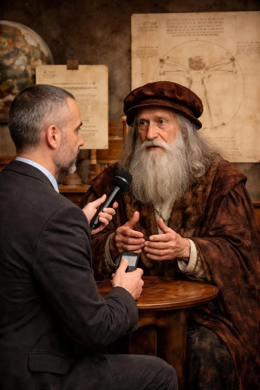
An ongoing series at stclaireart.com in which we imagine sitting down with the greatest artists in history.
Me: You are perhaps the most famous artist who ever lived. Does that word — "artist" — even feel adequate to describe what you do?
Leonardo: It makes me smile, and not entirely with pleasure. A painter, they call me. As if the eye and the hand are the whole of it. But the eye must be educated by the mind, and the mind must be fed by everything — the way water moves around a stone, the way light enters an eye, the way a muscle pulls against a bone.
Me: So the painting is almost the last step.
Leonardo: Exactly so. I have never understood why a man would choose to know only one thing. The world is not divided into categories. Why should I be?
Me: Your notebooks are filled with inventions, anatomy, mathematics, music. Did you ever feel pulled in too many directions? Did it torment you?
Leonardo: (A long pause. He turns a stylus over in his fingers.) Torment is perhaps the right word, yes. There were patrons who thought otherwise — who called it laziness, distraction. Ludovico Sforza wanted his horse monument and I gave him ten years of thinking about it and then the bronze went to cannons instead.
Me: That must have been infuriating.
Leonardo: (He shrugs, but there is old irritation in it.) What they could not understand is that I could not paint a face without first understanding what lies beneath it. I, shall we say “studied the interiors” of more than thirty human bodies. Did they think that was a hobby? Every painting I made was the last page of a very long book that no one else could see.
Me: What do critics and historians get most wrong about you?
Leonardo: That I left things unfinished out of some failure of will or discipline. The Adoration of the Magi. The Saint Jerome. They look at the bare wood and see abandonment. But a painting is a question, and sometimes the question is more interesting than any answer I could give it. I was interested in what a face is doing — what it is about to do, what it has just finished feeling. The moment before and the moment after. That is where life lives. Sometimes I would stand before a canvas for four days without making a single mark.
Me: Four days.
Leonardo: Four days. My patrons found this bewildering. I found it essential.
Me: Okay, one question I HAVE to ask…the Mona Lisa. Everyone wants to know. Who is she?
Leonardo: (He smiles slowly, as if he has been waiting for this and has also been dreading it.) She is the painting. That is who she is.
Me: That is a very elegant non-answer.
Leonardo: (Laughing.) You think so? I think it is the most precise answer available.
Me: Humor me. The smile — what is she thinking?
Leonardo: She is thinking several things at once. As people do.
Me: Leonardo.
Leonardo: (Still smiling.) I had musicians play for her while she sat. I wanted her caught between two feelings, the way a person is when music moves them unexpectedly. Not happy. Not sad. Present. Most portraits of that time were like windows with the shutters closed. I wanted a window with light coming through it.
Me: But who is she?
Leonardo: (A long pause. He looks at the table. Then, almost to himself —) She is very well protected, I think.
Me: Okay well…I get the message. Next question…If you had one day in the present — our world, right now — what would you do first?
Leonardo: (He does not hesitate.) I would find whoever is building the machines that fly between cities and I would ask to see the engines. Then I would ask to see inside a hospital — the imaging machines, the ones that see through skin. I have heard there are such things.
Me: There are. They're extraordinary.
Leonardo: (His eyes are bright.) I am sure they are. And then, perhaps in the evening, I would sit somewhere quiet and feel terrible about all the time I wasted sleeping.
Me: Last question. What would you say art is actually for?
Leonardo: Art is a form of paying attention. That is all, and it is everything. The world is richer than any one person can perceive in a lifetime, and a great painting forces you to slow down and see. Not to look. To see. Most people look at a face and think: face. A painter looks at a face and thinks: light, shadow, doubt, the memory of grief, the particular way this person holds their jaw when they are pretending to be unafraid. Art is the record of that deeper looking. Without it, we would all be moving through the world half blind.
Leonardo da Vinci (1452–1519) was a Florentine painter, sculptor, architect, musician, mathematician, engineer, inventor, anatomist, geologist, botanist, and writer. He is widely considered one of the greatest painters of all time and perhaps the most diversely talented person ever to have lived. His best known works include The Last Supper and Mona Lisa.
This is an imagined interview. Leonardo's responses are constructed from historical research, his own notebooks and documented writings, and a deep familiarity with his life and work. No direct quotes are presented as real.
No deceased artists were harmed in the making of this series.
A Closing Reflection: Nine Ways Beauty Finds Us

What started as a fairly simple question — how do different people create and receive art? — turned out to be a much larger one in disguise. Because this series was never really about artistic preference, and it wasn't even, ultimately, about personality. It was about the many ways human beings reach toward transcendence — and the many ways we hesitate when it begins to reach back.
Each type doesn't merely prefer different kinds of beauty. Each trusts a different pathway into what feels ultimate, meaningful, or real — some through order, some through relationship, some through achievement or identity, some through emotional depth, some through understanding, some through security, some through possibility, some through strength, and some through peace. Nine orientations, and nine distinct intuitions about what makes existence feel whole.
And yet what this series has made clearer to me with each installment is that every one of these doorways is partial. Each reveals something true — and each, by itself, leaves something out. The disciplined must discover wildness, the expressive must discover steadiness, the strong must discover tenderness, the peaceful must discover vitality, and the searching must discover rest. Not because their native orientation is wrong, but because beauty is larger than any single way of perceiving it. It expands us precisely by leading us beyond what's familiar.
Art becomes transformative at exactly this threshold — when it invites us into modes of perception that don't come naturally to us. When beauty unsettles our habits without destroying our center, something shifts. We don't grow by abandoning who we are. We grow by becoming more spacious within who we are. That distinction matters.
From my own vantage point — shaped by a lifelong sensitivity to longing, meaning, and the particular ache of things that resist easy expression — I've come to think of beauty as something that moves in two directions at once: deeper into the self, and wider into reality. Inward and outward simultaneously, each direction feeding the other.
Maybe that's what unites all nine responses in the end. Not a shared aesthetic and not a common emotional register, but a shared underlying motion: the reach toward something larger than the isolated self. Beauty is not only what we recognize. It is what completes what we didn't know was unfinished in us.
I'm grateful to have traced that motion through nine different lives. And I'm aware, writing this as a Four, that my own doorway has colored everything I've seen through all the others. That's not a flaw in the project — it's the point. No one stands outside personality when encountering beauty. We always approach from somewhere.
The hope is that by now, the somewhere feels a little wider than when we started.
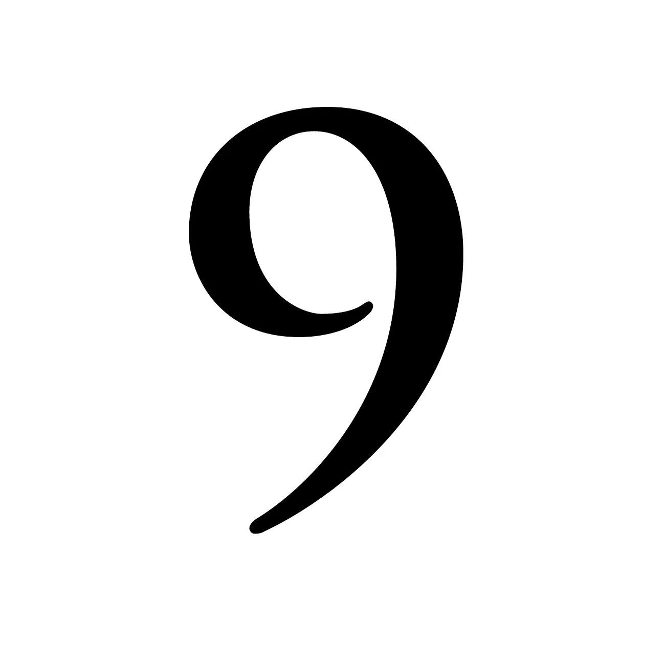
Type Nine: The Recognition of Wholeness
Some people encounter beauty as revelation. Others encounter it as force, or longing, or the thrill of possibility opening outward.
An Enneagram Type Nine encounters beauty as remembering.
Not discovery — remembering. A gentle recognition of something that feels strangely familiar, even when encountered for the first time. Where other types experience transcendence as ascent or breakthrough or awakening, the Nine experiences it as return — a restoration of harmony that somehow already existed, quietly, beneath all the noise.
Beauty doesn't take them somewhere else. It brings them home.
The shape of their world
Nines experience beauty as evidence that everything belongs together. They're drawn to forms, colors, sounds, and atmospheres that create coherence — not necessarily perfection, but rightness. A sense that nothing is forced, nothing is out of place, and nothing is demanding attention at the expense of something else. Beauty feels like alignment, like the easing of internal friction, like something that remembers how to exist without strain.
What moves them is rarely dramatic: balance, soft continuity, atmosphere rather than intensity, quiet spaciousness, and the sense that all parts are held within a larger whole. They don't need beauty to announce itself. They need it to simply be — coherent, unhurried, making room.
But beneath this orientation runs an important undercurrent. Nines long for harmony — and they can become skilled at avoiding whatever might disturb it. Beauty becomes not only transcendence but refuge, particularly from inner disturbance. The stillness they seek is real, but sometimes it's also a way of keeping certain things at bay.
How Type Nines make art
A Nine artist creates from deep receptivity. They don't impose vision so much as listen for emergence. Their work often feels less constructed than allowed — as though it formed naturally once space was made for it.
They're attuned to atmosphere in a way that's almost environmental. They sense subtle relationships between color and space, form and silence, movement and stillness, and they're often more skilled than they realize at creating work that holds these relationships without calling attention to the holding. Their art tends to feel gentle but enveloping, spacious rather than crowded, and integrative rather than confrontational. It doesn't demand attention. It invites presence.
There's usually a quiet continuity in what they make — transitions that feel organic, emotional tones that blend rather than collide, and compositions that allow the eye or mind to rest without tension. They're often creating environments rather than statements, and there's something genuinely rare in that capacity in a world that rewards loudness.
But here is where it gets complicated.
Nines value harmony so deeply that they can unconsciously avoid the very forces that generate profound artistic vitality. Conflict, disruption, sharp contrast, and emotional friction all produce depth, movement, and transformation — but they're also uncomfortable. And for a Nine, discomfort has a way of quietly redirecting the work before they've fully registered what's happened. Strong emotional intensity gets softened, creative risk gets postponed, and expression that might provoke — in themselves or in others — gets smoothed over.
The result can be beautiful, but it can also be muted and under-articulated, with a sense of depth present but not quite surfaced. This isn't because the Nine lacks depth — they're often among the most deeply feeling of all the types — but because they resist the disturbance that would bring it fully into view.
How Type Nines receive art
When a Nine encounters a work, they don't analyze it first. They enter it. They feel the emotional climate — the relational field the work creates — and sense immediately whether it's inviting or agitating, spacious or constricting, integrating or fragmenting. The first response is almost bodily: can I settle here? Can I rest inside this experience?
They're moved by art that creates felt wholeness — work that evokes stillness without emptiness, suggests connection across difference, and holds complexity without fragmenting it. They love art that doesn't demand performance from the viewer, that allows them simply to be present. When beauty creates a genuine sense of belonging within existence itself, a Nine feels it as nourishment in the most literal sense.
Art that is jarringly confrontational, that emphasizes fragmentation without integration, or that forces emotional intensity without any gesture toward resolution can overwhelm them. They may disengage — not from indifference but from genuine overload. Their nervous system is calibrated for resonance, not assault. The difficulty is that some of the most important art is also the most disturbing, and the Nine's instinct to protect their equilibrium can sometimes keep them at a distance from work that might otherwise change them.
The tension underneath
At the heart of the Nine's relationship with beauty lies a quiet paradox: they long for wholeness, but they often avoid the tensions that generate living wholeness.
True harmony isn't the absence of conflict. It's the integration of difference — edges meeting and transforming rather than being smoothed away before they can do their work. Nines can seek calm by eliminating friction rather than allowing friction to resolve into something richer. They experience unity, but sometimes at the cost of vivid aliveness, and they experience peace, but sometimes without full presence to themselves.
Beauty soothes them, but it can also awaken them. And awakening, even into something larger and more spacious, is not always gentle. That's the risk the Nine learns, slowly, to take.
What art can open up
The growth edge for a Nine is learning to stay present when art unsettles rather than soothes — to trust that disturbance, held within a meaningful form, won't destroy their equilibrium but deepen it.
When they allow themselves to remain with work that introduces dissonance or sharpness or emotional complexity, something shifts. They discover that disturbance doesn't destroy unity — it reveals a more spacious unity, one capable of holding everything, including what was previously too difficult to approach. This is not a small discovery for a Nine. It redraws the boundary of what peace is allowed to mean.
As artists, this tends to show up as permission — permission to include contrast without fear, to express personal perspective more directly, and to let tension remain visible in the work rather than resolving it prematurely. Their art still offers peace, but it becomes living peace, not merely quiet. It breathes. It moves. It contains difference without dissolving into fragmentation.
The Nine who has found this ground doesn't make less harmonious art. They make more honest art — and the honesty, paradoxically, makes the harmony more real.
A closing thought, from the perspective of a Four: of all the types in this series, the Nine is perhaps the one I've had to work hardest to understand from the inside — because on the surface, the Nine's world and the Four's world can look like opposites. The Four moves toward emotional intensity; the Nine moves away from it. The Four is drawn to what makes them feel distinct; the Nine dissolves into the larger whole. But writing this, I've come to think we're circling the same longing from different directions. The Four wants to be fully seen. The Nine wants everything to belong together. Both are reaching, in their own way, for the same thing: the experience of being home in existence, without anything left out. The Nine, at their most fully themselves, doesn't just remember that experience. They become it — a kind of living harmony that others can feel simply by being near them. That's not a small thing. That might, in fact, be its own form of art.
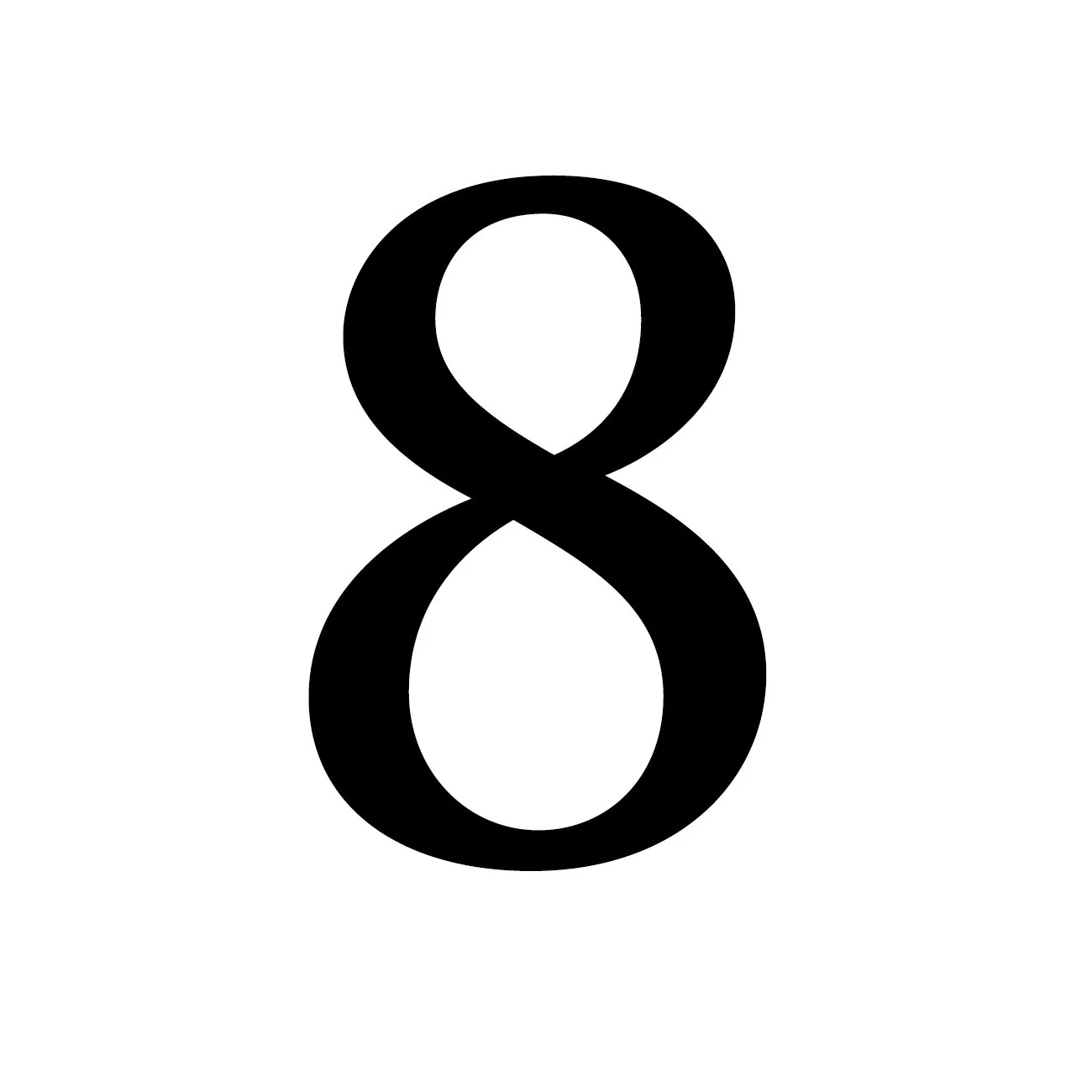
Type Eight: The Encounter with Unfiltered Reality
Some people approach beauty carefully. They ease into it and let it reveal itself gradually, meeting it on its own terms.
Enneagram Type Eight meets beauty the way they meet everything else: directly, fully, without flinching.
To a Type Eight, beauty isn't something to admire from a safe distance. It's something to meet, withstand, grapple with, and sometimes challenge. Where other types seek transcendence through harmony or meaning or emotional resonance, Eights seek it through contact with what is undeniably real. They don't trust surfaces easily. They don't surrender to illusion. They're drawn toward what carries weight, force, and consequence.
Beauty, for them, must be strong enough to stand its ground.
The shape of their world
Eights experience beauty not as refinement or delicacy but as aliveness that cannot be diminished. They respond to power, raw authenticity, physical or emotional intensity, and directness without pretense — a presence that refuses to be ignored. For them, beauty is not decorative, fragile, or sentimental.
They're drawn to what feels elemental — weather, stone, fire, conflict, endurance, survival. Even tenderness, when they recognize it, must feel sturdy rather than fragile. There's a foundational instinct operating underneath all of this: if something is truly beautiful, it will not collapse under pressure. And if it does collapse, then it was never fully real.
How Type Eights make art
An Eight artist creates from an inner stance of authority — not necessarily authority over others, but authority over their own presence in the world. They don't ask permission to create. They assert creation.
Their work is rarely tentative. They're drawn toward direct expression — bold forms, strong contrasts, physical scale or impact, emotional immediacy, and themes of struggle, endurance, and transformation. They favor materials that feel substantial and resistant. Even subtle work made by an Eight tends to carry an underlying solidity, a sense that something foundational is being confronted or revealed.
They're not interested in art that exists only to please. They're interested in art that stands up — that holds its ground against scrutiny, discomfort, or disagreement. Their creative process tends toward decisive action; they revise forcefully rather than delicately, shaping the work through engagement rather than contemplation. Creation, for them, isn't merely expression — it's impact. They want their art to do something, move something, confront something.
But there's a subtle vulnerability inside all that force — one that may not be immediately visible even to themselves.
Eights guard against weakness, against exposure, against being overpowered emotionally or relationally. Because of this, they can unconsciously avoid artistic territory that feels too unprotected — fragility without strength, quiet emotional nuance that can't be controlled, unresolved vulnerability, helplessness. They may equate softness with danger.
This can produce art of tremendous power and sometimes limited emotional range. Not because Eights lack tenderness — they have it, often in abundance — but because they protect it so fiercely that it rarely enters the work unarmored. Their art can confront the world boldly while concealing the most unguarded parts of themselves.
How Type Eights receive art
When an Eight encounters a work, they don't drift into it passively. They assess. They feel for substance, look for integrity, and sense whether the work is honest or evasive. The first question, often unspoken, is: does this have real weight — or is it posturing?
They're deeply affected by art that embodies undeniable presence — work that confronts reality directly, refuses sentimental simplification, demonstrates endurance, and reveals truth without flinching. They admire art that is not afraid, even when it reveals pain or conflict, and they're especially moved by vulnerability that remains standing. They respect strength — but what genuinely moves them is strength that includes exposure without collapse. That particular combination, power and openness held together without contradiction, is what they find most beautiful and most rare.
Art that feels evasive, ornamental, or emotionally manipulative frustrates them quickly. Work that seems overly precious, artificially beautified, or detached from real human stakes can feel like a kind of dishonesty. If they sense that art is trying to control their response rather than earn it, they disengage. They want authenticity, not persuasion.
The tension underneath
At the heart of the Eight's relationship with beauty lies a paradox they may spend years circling without fully seeing: they long for truth, but guard against vulnerability. They seek intensity, but resist exposure. They value authenticity, but protect precisely the parts of themselves that are most easily touched.
And yet beauty tends to reach us most deeply through those unguarded places.
Eights want contact with what is real. But full reality includes tenderness that cannot defend itself. That's the threshold they approach carefully — and sometimes retreat from, just before crossing.
What art can open up
Art offers Eights something that most of their ordinary life doesn't: a way to encounter vulnerability without loss of dignity. Through a work of art, they can experience fragility that is not weakness, openness that doesn't destroy strength, and tenderness that coexists with power rather than threatening it.
When they allow themselves to stay present with art that reaches their unprotected emotional core — when they resist the impulse to assess or push back and simply let the work land — something significant tends to happen. They discover that being moved is not the same as being overpowered, that intensity doesn't require hardness, and that they can be affected without being diminished.
As artists, this shift tends to make the work more spacious without making it softer in the ways they'd fear. They begin to allow emotional complexity without needing to dominate it, and to include vulnerability as intrinsic to strength rather than as its opposite. The art still carries presence — but now it also carries feeling that isn't armored. It doesn't merely confront reality. It reveals what it's actually like to live inside it.
From my own vantage point as a Four, the Eight's relationship to beauty can look, from the outside, like it's primarily about force. But I don't think that's quite right. What Eights are really after is something I recognize, even from a very different angle: they want contact with what's real. The difference is that where a Four goes inward to find that reality, an Eight goes straight at it. Both are attempts at the same thing — to encounter existence without the filters and protections that keep most of us at a comfortable remove. When an Eight finally lets beauty reach them where they're unguarded, the result isn't softness. It's wholeness. And that, I think, is a form of transcendence worth standing still for.
Blog Archive
-
2026
- Apr 29, 2026 Conversations Across Time: Caravaggio Apr 29, 2026
- Apr 26, 2026 Conversations Across Time: Raphael Apr 26, 2026
- Apr 21, 2026 Conversations Across Time: Michelangelo Apr 21, 2026
- Apr 16, 2026 Conversations Across Time: Sandro Botticelli Apr 16, 2026
- Apr 11, 2026 Conversations Across Time: Donatello Apr 11, 2026
- Apr 6, 2026 Conversations Across Time: Jan van Eyck Apr 6, 2026
- Apr 1, 2026 Conversations Across Time: Leonardo da Vinci Apr 1, 2026
- Mar 29, 2026 A Closing Reflection: Nine Ways Beauty Finds Us Mar 29, 2026
- Mar 27, 2026 Type Nine: The Recognition of Wholeness Mar 27, 2026
- Mar 24, 2026 Type Eight: The Encounter with Unfiltered Reality Mar 24, 2026
- Mar 18, 2026 Type Seven: The Pursuit of Radiant Possibility Mar 18, 2026
- Mar 16, 2026 Type Six: Beauty as Trust, Stability, and the Restoration of Ground Mar 16, 2026
- Mar 11, 2026 Type Five: Beauty as Insight and Essential Understanding Mar 11, 2026
- Mar 8, 2026 Type Four: Beauty as Identity and Emotional Truth Mar 8, 2026
- Mar 5, 2026 Type Three: Beauty as Significance and Radiance Mar 5, 2026
- Mar 1, 2026 Type Two: Beauty as Loving Connection Mar 1, 2026
- Feb 26, 2026 Type One: The Pursuit of Perfected Beauty Feb 26, 2026
- Feb 22, 2026 Why Personality Shapes the Way We Create and Experience Art Feb 22, 2026
- Feb 11, 2026 My Most Ambitious Project to Date: Pont Neuf at Dusk Feb 11, 2026
- Feb 8, 2026 The Human Rhythm: Why the Golden Section Matters Feb 8, 2026
- Jan 31, 2026 Nature’s Quiet Mathematics: The Golden Section at Work Jan 31, 2026
- Jan 24, 2026 The Golden Section in Architecture: Building with Human Scale Jan 24, 2026
- Jan 16, 2026 The Golden Section in Music: Proportions You Can Feel Jan 16, 2026
- Jan 14, 2026 The Golden Ratio in Art: Where Math Meets Beauty Jan 14, 2026
-
2025
- Dec 25, 2025 Finding Peace in the Christmas Chaos Dec 25, 2025
- Dec 14, 2025 Seeing Meaning: How Medieval Art Spoke Without Words Dec 14, 2025
- Nov 19, 2025 The Matterhorn and the Magic of Transformation Nov 19, 2025
- Nov 13, 2025 Commissions vs Completed Pieces…Which is Right for You? Nov 13, 2025
- Oct 28, 2025 What can I learn from Makoto Fujimura in 2025? Oct 28, 2025
- Oct 12, 2025 What can I learn from Pablo Picasso in 2025? Oct 12, 2025
- Oct 10, 2025 What can I learn from Raphael in 2025? Oct 10, 2025
- Oct 8, 2025 What can I learn from Georgia O’Keefe in 2025? Oct 8, 2025
- Sep 28, 2025 What can I learn from Caravaggio in 2025? Sep 28, 2025
- Jul 25, 2025 What can I learn from Thomas Gainsborough in 2025? Jul 25, 2025
- Jul 20, 2025 What can I learn from Leonardo da Vinci in 2025? Jul 20, 2025
- Jul 15, 2025 What can I learn from Michelangelo in 2025? Jul 15, 2025
- Jul 2, 2025 What can I learn from Van Gogh in 2025? Jul 2, 2025
- Jun 25, 2025 What can I learn from Renoir in 2025? Jun 25, 2025
- Jun 23, 2025 What can I learn from Claude Monet in 2025? Jun 23, 2025
- Jun 21, 2025 Using Complimentary Colors for Shading Jun 21, 2025
- Jun 17, 2025 How and When to use Complimentary Colors Jun 17, 2025
- May 30, 2025 Perspective in Art 101: How to Make Your Drawings Pop Off the Page May 30, 2025
- May 26, 2025 How to Really Understand Medieval Art May 26, 2025
- May 22, 2025 Staying Creative May 22, 2025
- May 10, 2025 AT Experience May 10, 2025
- May 3, 2025 Go Take a Walk! May 3, 2025
- Apr 25, 2025 Periods of Art: Mannerism Apr 25, 2025
- Apr 17, 2025 Finding Meaning in the Abstract: Pointers for Understanding Modern Art Apr 17, 2025
- Apr 16, 2025 The Quiet Labor Apr 16, 2025
- Apr 12, 2025 To Art: a Poem Apr 12, 2025
- Apr 5, 2025 The Enchantment of Art Nouveau Apr 5, 2025
- Mar 23, 2025 "What was it like going to art school?" Mar 23, 2025
- Mar 18, 2025 Why I Love the Rococo Period Mar 18, 2025
- Mar 4, 2025 Expressing Joy Through Art Mar 4, 2025
- Feb 28, 2025 The Connection Between Art and Frustration Feb 28, 2025
- Feb 23, 2025 Neoclassicism: Bringing Ancient Style Back to Life Feb 23, 2025
- Feb 18, 2025 On my walk Feb 18, 2025
- Feb 12, 2025 Art at the Very Beginning Feb 12, 2025
- Feb 10, 2025 Monet and Renoir: A Personal Reflection on Their Differences Feb 10, 2025
- Feb 6, 2025 The Fount of Creation: A poem Feb 6, 2025
- Feb 1, 2025 The Connection Between Art and Grief Feb 1, 2025
- Jan 29, 2025 A Journey Through Medieval Art: Stories from the Middle Ages Jan 29, 2025
- Jan 26, 2025 The Story of Art: The Romantic Period Jan 26, 2025
- Jan 16, 2025 The Relationship Between Music and Painting Jan 16, 2025
- Jan 12, 2025 Periods of Art: Baroque Jan 12, 2025
- Jan 11, 2025 Marketing your Artwork Jan 11, 2025
- Jan 7, 2025 Exploring the Golden Ratio in Art Jan 7, 2025
- Jan 3, 2025 Artistic Enlightenment: Lessons from Italy Jan 3, 2025
-
2024
- Dec 29, 2024 Why Travel is Crucial for Unleashing Creativity Dec 29, 2024
- Dec 22, 2024 Steps to Becoming a Full-Time Professional Artist Dec 22, 2024
- Dec 10, 2024 How to Determine Subject Matter for Your Next Painting Dec 10, 2024
- Dec 3, 2024 My Favorite Artist Dec 3, 2024
- Dec 1, 2024 Creativity and Exploration Dec 1, 2024
- Nov 13, 2024 Impressionistic Heroes of Mine Nov 13, 2024
- Nov 10, 2024 "So how do you DO this?" Nov 10, 2024
- Nov 3, 2024 Discovering the Bond Between Nature and Art Nov 3, 2024
- Nov 1, 2024 How Art Can Help Us Cope with Stress Nov 1, 2024
- Oct 27, 2024 How to Select the Perfect Art for Your Home Oct 27, 2024
- Oct 24, 2024 What to Do When You Feel Like Giving Up as an Artist Oct 24, 2024
- Oct 14, 2024 Book Review: The Artist’s Way Oct 14, 2024
- Oct 11, 2024 How to find Inspiration for your art Oct 11, 2024
- Sep 24, 2024 Crafting the Perfect Title for Your Artwork Sep 24, 2024
- Sep 14, 2024 The Worst Advice I’ve Ever Received as an Artist Sep 14, 2024
- Sep 8, 2024 Overcoming Artist’s Block: Practical Tips Sep 8, 2024
- Aug 30, 2024 Exploring Lessons from Vincent van Gogh Aug 30, 2024
- Aug 29, 2024 Why Purchase Original Artwork? Aug 29, 2024
- Aug 25, 2024 How do you determine the best size artwork to purchase? Aug 25, 2024
- Aug 15, 2024 "So, what's this painting worth?" Aug 15, 2024
- Aug 9, 2024 What color art would go best in my home? Aug 9, 2024
- Aug 4, 2024 How to deal with criticism as an artist Aug 4, 2024
- Mar 27, 2024 Question 12: "What do you do when you have a mental block?" Mar 27, 2024
- Mar 27, 2024 New Goals + Winter Months = "Outside the Box" Creativity Mar 27, 2024
- Jan 8, 2024 Question 11: Where do you get inspiration for your work? Jan 8, 2024
-
2023
- Sep 11, 2023 Question 10: "Do you have your work in galleries?" Sep 11, 2023
- Aug 27, 2023 Question 9: "How do you manage the business side of your art business?" Aug 27, 2023
- Aug 20, 2023 Question 8: "Do you advertise?" Aug 20, 2023
- Aug 13, 2023 Question 7: "How do you price your work?" Aug 13, 2023
- Jul 30, 2023 Question 6: "What are the positive points and negative points about having an 'open studio'?" Jul 30, 2023
- Jul 19, 2023 Question 5: "Would you mind critiquing my work at some point?" Jul 19, 2023
- Jul 1, 2023 Question 4: "Would you recommend art school, and if so, how would you find the right one?" Jul 1, 2023
- Jun 24, 2023 Question 3: "Did you go to art school? If so, where?" Jun 24, 2023
- Jun 16, 2023 Question 2: "How long have you been selling your work professionally?" Jun 16, 2023
- Jun 10, 2023 Question 1..."How long have you been an artist?" Jun 10, 2023
- Jun 4, 2023 So, you're thinking about art as a career? Jun 4, 2023
- Mar 3, 2023 "What inspires you as an artist?" Mar 3, 2023
- Feb 15, 2023 Should I buy a completed painting OR commission a painting? Feb 15, 2023
- Jan 23, 2023 "How do you Price Your Work?" Jan 23, 2023
-
2022
- Dec 1, 2022 An Artist in Italy (Part 3) Dec 1, 2022
- Nov 16, 2022 An Artist in Italy (Part 2) Nov 16, 2022
- Nov 8, 2022 An Artist in Italy (Part 1) Nov 8, 2022
- Oct 10, 2022 When Remodeling a Home... Oct 10, 2022
- Aug 22, 2022 How to Handle Failure Aug 22, 2022
- Jun 3, 2022 "What is it like being an artist these days?" Jun 3, 2022
- May 21, 2022 "Are All Artists Introverts?" May 21, 2022
- May 9, 2022 What Makes a Painting a Good Piece of Art? May 9, 2022
- Apr 1, 2022 The Story Behind…"Gentle Showers on a Summer Afternoon" Apr 1, 2022
- Mar 19, 2022 The Story Behind..."Blue Ridge Summer Afternoon" Mar 19, 2022
- Feb 18, 2022 Your Opinion Please... Feb 18, 2022
- Jan 22, 2022 What's in a Compliment? Jan 22, 2022
-
2021
- Dec 25, 2021 My Christmas Present to Joy Dec 25, 2021
- Dec 12, 2021 Deep in the Heart Dec 12, 2021
- Nov 29, 2021 "How do you know you're done with a painting?" Nov 29, 2021
- Nov 1, 2021 Does it Matter What Other People Think of My Art? Nov 1, 2021
- Oct 12, 2021 Creatively Inhaling... Oct 12, 2021
- Aug 31, 2021 More Fun than I Know What to do With Aug 31, 2021
- Aug 13, 2021 “Are You Self Taught?” Aug 13, 2021
- Jul 21, 2021 New Art Gallery on the West Coast Jul 21, 2021
- Jun 23, 2021 "Art from the Heart" vs "Commissioned Art" Jun 23, 2021
- May 28, 2021 More Questions and Answers May 28, 2021
- May 17, 2021 What does Diversity have to do with honest artwork? May 17, 2021
- May 4, 2021 More Questions and Answers May 4, 2021
- Apr 30, 2021 Questions and Answers Apr 30, 2021
- Apr 16, 2021 And the Next Blog Post is... Apr 16, 2021
- Mar 10, 2021 How do you create when you don't feel like creating? Mar 10, 2021
- Feb 11, 2021 "Mullaghmore": The Story Behind the Painting Feb 11, 2021
- Jan 28, 2021 A Look Back to "The Dark Year" Jan 28, 2021
- Jan 17, 2021 Studio Expansion...Hello Northeast! Jan 17, 2021
- Jan 7, 2021 How to Create the Perfect Painting Jan 7, 2021
-
2020
- Dec 1, 2020 A personal answer to a personal question... Dec 1, 2020
- Nov 4, 2020 Using Art to Express my Politics Nov 4, 2020
- Oct 16, 2020 Sometimes, just "having fun" is a good enough reason Oct 16, 2020
- Oct 4, 2020 The Best Painting Delivery Ever... Oct 4, 2020
- Sep 7, 2020 How a Dinky Little Virus Changed my Art Business Sep 7, 2020
- Aug 9, 2020 Adaptation: Survival of the Most Flexible Aug 9, 2020
- Aug 3, 2020 Story Behind the Painting: "Sundown over the Blue Ridge" Aug 3, 2020
- Jul 18, 2020 Cure for Covid blues Jul 18, 2020
- Jul 5, 2020 Where Does it Take You? Jul 5, 2020
- Jun 3, 2020 Story Behind the Painting: Autumn Day on the French Broad River Jun 3, 2020
- May 24, 2020 Story Behind the Painting: Saint-Jean-Cap-Ferrat May 24, 2020
- Apr 30, 2020 Q&A: SESSION TWO Apr 30, 2020
- Apr 22, 2020 Q&A: SESSION ONE Apr 22, 2020
- Apr 8, 2020 What I'll Miss When This Pandemic is Over... Apr 8, 2020
- Mar 20, 2020 Entertaining Angels Unawares Mar 20, 2020
- Mar 8, 2020 In Celebration of Art Mar 8, 2020
- Feb 27, 2020 "The Bridge" Feb 27, 2020
- Feb 8, 2020 The Most Interesting Question of the Year (but it's only February so...) Feb 8, 2020
- Jan 29, 2020 "Can I Watch You?" Jan 29, 2020
- Jan 14, 2020 From Point A to Point Z Jan 14, 2020
- Jan 5, 2020 An Impractical Idea Jan 5, 2020
-
2019
- Dec 17, 2019 My Beautiful Baby on Display Dec 17, 2019
- Dec 3, 2019 Regarding the Selection of an Artistic Theme Dec 3, 2019
- Nov 20, 2019 "What's Your Best Price on This Piece?" Nov 20, 2019
- Nov 13, 2019 A Really Unique Commission Project Nov 13, 2019
- Nov 6, 2019 Fun with Art Scammers Nov 6, 2019
- Nov 3, 2019 "How did you know you wanted to be an artist?" Nov 3, 2019
- Oct 30, 2019 How do you know when a painting is "done"? Oct 30, 2019
- Oct 20, 2019 The piece I had to paint: "Côte d’Azur" Oct 20, 2019
- Oct 18, 2019 Inspiration Everywhere! Oct 18, 2019
- Aug 26, 2019 Contentment vs Restlessness Aug 26, 2019
- Aug 14, 2019 "Why Should I Purchase Artwork?" Aug 14, 2019
- Aug 11, 2019 What Was Art School Like? Aug 11, 2019
- Aug 7, 2019 "The Four Seasons on the French Broad River" Aug 7, 2019
- Jul 30, 2019 Joy Unspeakable Jul 30, 2019
- Jul 7, 2019 Of Mountains and Oceans Jul 7, 2019
- Jul 3, 2019 Lessons I've Learned as an Artist Jul 3, 2019
- Jun 26, 2019 St.Claire Art Opening at the AC Hotel, Asheville Jun 26, 2019
- Jun 23, 2019 "How do you decide what to paint?" Jun 23, 2019
- Jun 5, 2019 One of my All-Time Heroes Jun 5, 2019
- Jun 2, 2019 Regarding "Inspiration" vs "Necessity" Jun 2, 2019
- May 29, 2019 The Best Complement I've Ever Received May 29, 2019
- May 19, 2019 "What are you Working on These Days?" May 19, 2019
- May 5, 2019 "Frankenstein-ing" a painting May 5, 2019
- Apr 17, 2019 The Big Reveal Apr 17, 2019
- Apr 3, 2019 "How do you Decide What to Paint?" Apr 3, 2019
- Mar 27, 2019 "I'm just not making the sales I need!" Mar 27, 2019
- Mar 20, 2019 Making the Most of Mistakes Mar 20, 2019
- Mar 10, 2019 Exploring Austin Galleries, Part 2 Mar 10, 2019
- Feb 25, 2019 Exploring Austin Galleries, Part 1 Feb 25, 2019
- Feb 10, 2019 Progress! Feb 10, 2019
- Jan 23, 2019 Preliminary Photos of my "Sails" Prototypes Jan 23, 2019
- Jan 16, 2019 The Benefits of Slowing Down Jan 16, 2019
- Jan 8, 2019 New Idea Taking Shape Jan 8, 2019
-
2018
- Dec 29, 2018 Looking Back and Looking Ahead Dec 29, 2018
- Dec 19, 2018 Percolating Creativity Dec 19, 2018
- Dec 16, 2018 So then... Dec 16, 2018
- Dec 12, 2018 What if... Dec 12, 2018
- Dec 5, 2018 Recent Projects on my Plate Dec 5, 2018
- Dec 3, 2018 Claude: My Creative Hero and Muse Dec 3, 2018
- Nov 22, 2018 Lessons I've Learned as an Artist Nov 22, 2018
- Nov 12, 2018 Planning for a Second Studio Location! Nov 12, 2018
- Nov 7, 2018 Steps Involved with a Painting Commission Nov 7, 2018
- Nov 4, 2018 How do you stay "balanced"? Nov 4, 2018
- Oct 28, 2018 What makes art "Art"? Oct 28, 2018
- Oct 21, 2018 "How Did You Stumble Across This Type of Artwork?" Oct 21, 2018
- Oct 17, 2018 "A Personal History" Oct 17, 2018
- Oct 14, 2018 Commission Confusion Oct 14, 2018
- Oct 10, 2018 "Aqueous Dream" Oct 10, 2018
- Oct 7, 2018 Beauty in the Center of the Pit Oct 7, 2018
- Sep 30, 2018 Only North Carolina? Sep 30, 2018
- Sep 23, 2018 The Price of Being a Landscape Painter Sep 23, 2018
- Sep 9, 2018 Thoughts on New Directions, New Possibilities Sep 9, 2018
- Aug 29, 2018 SURVEY: GLOSSY OR SATIN Aug 29, 2018
- Aug 22, 2018 Regarding Commissioning a Painting Aug 22, 2018
- Aug 19, 2018 On the Brink of a Huge Failure Aug 19, 2018
- Aug 7, 2018 "The Trail That Never Ends" Aug 7, 2018
- Aug 5, 2018 Inspration Begets Inspiration Aug 5, 2018
- Jul 19, 2018 Rejuvenating Creativity! Jul 19, 2018
- Jul 15, 2018 A Word About Accolades Jul 15, 2018
- Jul 10, 2018 Where it Began Jul 10, 2018
- Jul 4, 2018 Funny Things People Say in an Art Studio Jul 4, 2018
- Jun 29, 2018 "The Time Between Times" Jun 29, 2018
- Jun 27, 2018 World View #8: Post Modernism Jun 27, 2018
- Jun 21, 2018 World View #7: New Age Pantheism Jun 21, 2018
- Jun 12, 2018 A New Opportunity -- A New Idea Jun 12, 2018
- Jun 6, 2018 The Art of Dinner (at the Grove Park Inn) Jun 6, 2018
- Jun 3, 2018 National Geographic?!? Jun 3, 2018
- Jun 1, 2018 World View #6: Modernism Jun 1, 2018
- May 24, 2018 The Art of Dinner (with the Dallas Cowboys) May 24, 2018
- May 13, 2018 Carving Mountains from Scratch May 13, 2018
- May 10, 2018 "Trigger Warning" May 10, 2018
- May 7, 2018 World View #5: Existentialism May 7, 2018
- Apr 29, 2018 World View #4: Nihilism Apr 29, 2018
- Apr 11, 2018 World View #3: Naturalism Apr 11, 2018
- Apr 4, 2018 World View #2: Deism Apr 4, 2018
- Mar 26, 2018 World View #1: Theism Mar 26, 2018
- Mar 23, 2018 A Time to be Disturbed Mar 23, 2018
- Mar 14, 2018 Understanding Art 101 Mar 14, 2018
- Mar 8, 2018 The Organ Mountains Mar 8, 2018
- Mar 7, 2018 "Remember...there are no mistakes with art" Mar 7, 2018
- Mar 2, 2018 The Biltmore Estate Mar 2, 2018
- Feb 21, 2018 How to Make a Living as an Artist (Part 2) Feb 21, 2018
- Feb 12, 2018 How to Make a Living as an Artist Feb 12, 2018
- Feb 4, 2018 How do you create when you don't feel creative? Feb 4, 2018
- Jan 24, 2018 Gallery Representation in Hendersonville! Jan 24, 2018
- Jan 19, 2018 Metalizing the Biltmore Estate Jan 19, 2018
- Jan 15, 2018 Four Seasons on the Blue Ridge Jan 15, 2018
- Jan 11, 2018 About Ice... Jan 11, 2018
- Jan 10, 2018 What's Next? Jan 10, 2018
-
2017
- Dec 20, 2017 Mountain Top Experiences Dec 20, 2017
- Dec 18, 2017 The Power of Mystery Dec 18, 2017
- Dec 7, 2017 Forsyth Park Fountain Dec 7, 2017
- Dec 6, 2017 Angsty or Terrified? Dec 6, 2017
- Dec 4, 2017 To the "Angsty" Artist... Dec 4, 2017
- Dec 3, 2017 "I woudn't pay HALF of what he's asking!" Dec 3, 2017
- Nov 20, 2017 "On the Water" Nov 20, 2017
- Nov 19, 2017 Song of Autumn Nov 19, 2017
- Nov 15, 2017 "Top of the Mountain" Nov 15, 2017
- Nov 5, 2017 "How do you decide what to paint?" Nov 5, 2017
- Nov 2, 2017 "Valley of Shadows" Nov 2, 2017
- Nov 1, 2017 Forest of Autumn Gold Nov 1, 2017
- Oct 25, 2017 Then and Now Oct 25, 2017
- Oct 24, 2017 Catawba Falls Oct 24, 2017
- Oct 18, 2017 "Valley of Shadows" Oct 18, 2017
- Oct 11, 2017 Autumn River Song Oct 11, 2017
- Oct 3, 2017 Autumnal Shift Oct 3, 2017
- Sep 28, 2017 Mystic Summer Morning Sep 28, 2017
- Sep 24, 2017 Valley of Shadows Sep 24, 2017
- Sep 1, 2017 the breakers Sep 1, 2017
- Aug 24, 2017 When the Sun Went Dark Aug 24, 2017
- Aug 17, 2017 Secret Blog Post Aug 17, 2017
- Aug 14, 2017 Waterfalls Everywhere! Aug 14, 2017
- Aug 11, 2017 "Cullasaja Falls" Completion photo Aug 11, 2017
- Aug 8, 2017 Finishing up "My Marathon" Aug 8, 2017
- Aug 1, 2017 One of the Best Days Ever! Aug 1, 2017
- Jul 26, 2017 "Glacial Fractures in situ" Jul 26, 2017
- Jul 24, 2017 Inspiration and Rest Jul 24, 2017
- Jul 18, 2017 Half Baked Ideas... Jul 18, 2017
- Jul 13, 2017 Oaks on the Water Jul 13, 2017
- Jul 9, 2017 Challenged to the Core Jul 9, 2017
- Jul 5, 2017 Boats on the Water Jul 5, 2017
- Jun 30, 2017 Glacial Fractures Jun 30, 2017
- Jun 29, 2017 Winter in the Summer! Jun 29, 2017
- Jun 27, 2017 What's in a Compliment? Jun 27, 2017
- Jun 23, 2017 Thoughts on a Mighty Failure Jun 23, 2017
- Jun 20, 2017 Sunrise on the Mountain Jun 20, 2017
- Jun 14, 2017 The Last Sunset (is that dramatic or what?) Jun 14, 2017
- Jun 12, 2017 Sunset or Sunrise? End or Beginning? Jun 12, 2017
- Jun 9, 2017 At the End of the Day Jun 9, 2017
- Jun 8, 2017 Giverny: My Homage to the Man Jun 8, 2017
- Jun 2, 2017 A Funny Thing Happened at the Studio Today... Jun 2, 2017
- Jun 2, 2017 Sunrise, Sunset... Jun 2, 2017
- May 29, 2017 Color Explosion May 29, 2017
- May 22, 2017 My Largest Painting to Date... May 22, 2017
- May 18, 2017 What to do with 2000 visitors in an art studio... May 18, 2017
- May 9, 2017 My Creative Muse May 9, 2017
- May 3, 2017 Joys of Life May 3, 2017
- Apr 28, 2017 Regarding Art & Beauty Apr 28, 2017
- Apr 25, 2017 Getting Better Acquainted Apr 25, 2017
- Apr 23, 2017 Rainy Sunday Morning Thoughts Apr 23, 2017
- Apr 22, 2017 Personal Thoughts Apr 22, 2017
- Apr 19, 2017 Favorite Hikes (Inspiration in the Making)... Apr 19, 2017
- Apr 15, 2017 Inspiration is Everywhere (some of our favorite hiking trails) Apr 15, 2017
- Apr 9, 2017 "Where should we eat tonight?" Apr 9, 2017
- Apr 6, 2017 Who Else Should We See in the District? Apr 6, 2017
- Apr 1, 2017 Spring in Western North Carolina Apr 1, 2017
- Mar 29, 2017 "Can you really make a living here?" Mar 29, 2017
- Mar 25, 2017 Of Ruination and Rescue Mar 25, 2017
- Mar 21, 2017 How I decide what to paint... Mar 21, 2017
- Mar 18, 2017 Musings of an artist... Mar 18, 2017
- Mar 14, 2017 Winter thoughts Mar 14, 2017
- Mar 13, 2017 "What makes this painting so sparkly?" Mar 13, 2017
- Mar 10, 2017 You're From Where? Mar 10, 2017
- Mar 5, 2017 "No Boundaries" Mar 5, 2017
- Mar 3, 2017 Appalachian Trail Mar 3, 2017
- Mar 2, 2017 What is 'good' art? Mar 2, 2017
- Feb 26, 2017 A Trip to the Art Museum Feb 26, 2017
- Feb 23, 2017 "The Rules" of Art Feb 23, 2017
- Feb 15, 2017 To School or Not to School... Feb 15, 2017
- Feb 10, 2017 How Do I Start This Thing? Feb 10, 2017
- Feb 9, 2017 Rocky Mountains reflection Feb 9, 2017
- Feb 7, 2017 Getting Inspired Feb 7, 2017
- Feb 5, 2017 Inspiration for a painting... Feb 5, 2017
- Jan 31, 2017 Understanding Abstract Art Jan 31, 2017
- Jan 29, 2017 Chi Jan 29, 2017
- Jan 26, 2017 Process: Rocky Mountain Commission Jan 26, 2017
- Jan 12, 2017 "Summer Path Thru the Birch Trees" Jan 12, 2017
- Jan 9, 2017 "Daybreak" Jan 9, 2017
-
2016
- Dec 31, 2016 Revisiting a friend Dec 31, 2016
- Dec 28, 2016 The Trial Run Dec 28, 2016
- Dec 17, 2016 Asheville Channel Interview Dec 17, 2016
- Nov 28, 2016 "Big Mamma" begins to sing.... Nov 28, 2016
- Nov 22, 2016 An Experiment with Moonlight Nov 22, 2016
- Nov 17, 2016 Transfiguration Nov 17, 2016
- Nov 11, 2016 My Cluttered World Nov 11, 2016
- Oct 30, 2016 Sacred Space Oct 30, 2016
- Oct 22, 2016 Omikron (Fire & Ice) Oct 22, 2016
- Oct 19, 2016 "Do you know what you're going to paint?" Oct 19, 2016
- Oct 15, 2016 "Golden Pathway" Oct 15, 2016
- Oct 14, 2016 Flowers, Flowers Everywhere Oct 14, 2016
- Oct 13, 2016 OKC 2 ("The Bridge") Oct 13, 2016
- Oct 12, 2016 Headed west... Oct 12, 2016
- Sep 7, 2016 A Year of "Largest" Sep 7, 2016
- Aug 2, 2016 Transformation of an idea... Aug 2, 2016
- Jul 27, 2016 Beginning my "marathon" painting: Cullasaja Falls Jul 27, 2016
- Jul 18, 2016 My Marathon Jul 18, 2016
- Jul 13, 2016 Welcome! Jul 13, 2016
- Jul 11, 2016 Aegean Waters Jul 11, 2016
- Jul 2, 2016 The Red Planet Jul 2, 2016
- Jun 17, 2016 Puzzling and Playing Jun 17, 2016
- Jun 10, 2016 St.Claire Art Studio Tour Jun 10, 2016
- Jun 6, 2016 Hominy Valley Jun 6, 2016
- May 25, 2016 "The Acolytes" is installed in Georgetown, SC May 25, 2016
- May 19, 2016 "Zuma" May 19, 2016
- May 18, 2016 Fishy Art May 18, 2016
- May 13, 2016 "The Journey" May 13, 2016
- May 10, 2016 Hyatt Ridge (26" x 16") May 10, 2016
- May 5, 2016 "Broad River in October" May 5, 2016
- May 2, 2016 A Blast From the Past May 2, 2016
- Apr 22, 2016 Beginnings II Apr 22, 2016
- Apr 21, 2016 Appalachian Panorama Apr 21, 2016
- Apr 18, 2016 "How do you get the aluminum on the painting?" Apr 18, 2016
- Apr 14, 2016 Beginnings Apr 14, 2016
- Mar 24, 2016 St. Claire Art News & Updates Mar 24, 2016
- abstract
- aluminum leaf
- Appalachian Trail
- art as a career
- art business
- art career
- art career advice
- art commission
- art composition
- art creation
- art critique
- art education
- Art Gallery
- art gallery
- art history
- art inspiration
- art marketing
- art movements
- art periods
- art poetry
- art process
- art purchase
- art sales
- art school
- Art Studio
- art studio
- art studios
- Art Studios
- art technique
- artist
- Artist advice
- artist advice
- artist representation
- artisti creation
- artistic expression
- artistic inspiration
- artwork
- Artwork
- Asheville
- asheville
- Asheville art gallery
- Asheville art studio
- Asheville artist
- Asheville artists
- Autumn
- autumn
- birch
- blue
- Blue Ridge
- commission
- Commission
- complimentary colors
- contemporary art
- creative inspiration
- Creativity
- creativity
- cullasaja falls
- fine art
- golden section
- grief
- grove park inn
- Hiking
- impressionism
- inspiration
- installation art
- landscapes
- medieval art
- mountain trails
- mountains
- North Carolina
- ocean
- ocean artwork
- oil painting
- Oil paintings
- origins
- process
- Professional artist
- red
- reflection
- Renoir
- Resin art
- River
- River Arts District
- Statement peice
- studio
- summer
- sunset
- Sunset
- travel
- travel and creativity
- trees
- understanding art
- unique wall art
- water
- waterfall
- wave
- western north carolina
- Western North Carolina
- woods
- World Views