
Art Blog
This blog is for posting photos of new artwork and for the expression of sometimes random thoughts of oil painter Stephen St. Claire.
What can I learn from Renoir in 2025?
As I reflect on my own practice in 2025, I keep coming back to artists whose lives were shaped not just by what they created, but by how they saw the world. Pierre-Auguste Renoir is one of those artists. His work feels joyful and alive—but what I find even more compelling is the way he chose to live and work, especially in the face of challenge.
Renoir believed that art should be beautiful. That may sound simple, even old-fashioned, but in a time like ours—when so much art is expected to be urgent, edgy, or politically charged—it’s refreshing to remember that joy, tenderness, and pleasure are valid, even radical, subjects.
“I just let my brush go; I try to paint my joy, my feeling.”
There’s a warmth in Renoir’s work that feels deeply human. He painted people—friends, family, everyday scenes—not as symbols or statements, but as living, breathing beings. And that reminds me that even now, when so much is mediated through screens, art can still be intimate. Personal. Close.
Renoir’s commitment to painting didn’t fade, even as his health did. In his later years, he suffered from severe rheumatoid arthritis. He couldn’t walk easily. His hands were twisted. And still—he painted. He had brushes strapped to his fingers. Helpers moved the canvas for him. That resilience humbles me. It makes it harder to justify the times I put off painting because I’m tired, distracted, or self-critical.
There’s also something beautiful in the way Renoir never stopped evolving. His style shifted—sometimes subtly, sometimes dramatically—but he never lost that core sense of affection for life. Even in pain, he saw color. He saw beauty. He believed in making something that lifted the spirit.
Renoir’s life reminds me that art doesn’t have to shout to be meaningful. It can be gentle. It can be beautiful. It can be kind. And honestly, in 2025, maybe we need more of that, right?
What can I learn from Claude Monet in 2025?

As an artist in 2025, I often feel pulled in a dozen directions—by trends, deadlines, social media, and the constant churn of what’s next. But whenever I revisit the life of Claude Monet, I feel something settle inside me (and considering the fact Monet is world famous, I assume I’m not alone here). His story isn’t just part of art history—it feels like a quiet, steady voice reminding me what really matters as an artist.
One of the things I appreciate most about Monet is that he stayed true to his vision, even when critics dismissed his work and galleries rejected him. “Impressionism” started as a put-down. But he kept painting what he saw: fleeting light, shifting weather, reflections on water. His commitment to his own way of seeing feels especially powerful now, when it’s easy to lose your voice in the noise.
“Creative depth comes from attention, not novelty.”
Monet’s habit of painting in series—his haystacks, cathedrals, water lilies—wasn’t just repetition. It was deep exploration and I LOVE that that whole idea: You don’t always need a new subject, just a new way of seeing what’s in front of you.
He was also deeply connected to nature. Painting outdoors, cultivating his own garden at Giverny—it was all part of his practice. In an increasingly digital world, that physical connection to the land and seasons feels more vital than ever. I try to remember that when I need to reset: step outside, pay attention, slow down.
Monet also knew how to endure. He painted through grief, through financial hardship, and even as his vision deteriorated. Those late Water Lilies, so dreamlike and abstract, came from a place of both loss and peace. It’s a reminder that art can age with us—and carry us through all kinds of seasons.
And maybe most importantly, Monet shaped a world around him that fed his creativity. His home and garden were part of the work. That idea—that we can build environments that nurture our art—feels incredibly relevant to me now.
Monet’s life reminds me that being an artist is about more than producing work. It’s about staying present, staying curious, and staying true—even when no one’s watching.
How and When to use Complimentary Colors

Complementary colors are one of the simplest but most powerful tools an artist can use to make their work pop. These are colors that sit opposite each other on the color wheel — like red and green, blue and orange, or yellow and purple. When placed side by side, complementary colors create a strong contrast that can instantly catch a viewer’s eye.
The best time to use complementary colors is when you want to create energy, excitement, or a clear focal point in your art. For example, if you paint a bright orange sunset behind a deep blue ocean, both colors will look more vibrant because of how they react against each other. The contrast makes each color seem even more intense.
“The best time to use complementary colors is when you want to create energy…”
You can also use complementary colors in smaller doses to draw attention to specific areas of a painting. A mostly green landscape with a few bright red flowers will naturally guide the viewer’s eye to the flowers without needing any extra tricks.
However, it’s important to use complementary colors thoughtfully. Too much of them side by side can be overwhelming or even uncomfortable to look at. One trick is to choose one color as the dominant color and use its complement just for accents. This creates a balanced, dynamic effect without overpowering the piece.
Complementary colors are not just for paintings, either. Designers, photographers, and even fashion stylists use them to create bold, memorable looks.
Once you start paying attention, you’ll see complementary colors everywhere — in nature, in ads, in your favorite artworks. Learning how and when to use them gives your art an extra level of impact that feels both exciting and natural.
AT Experience
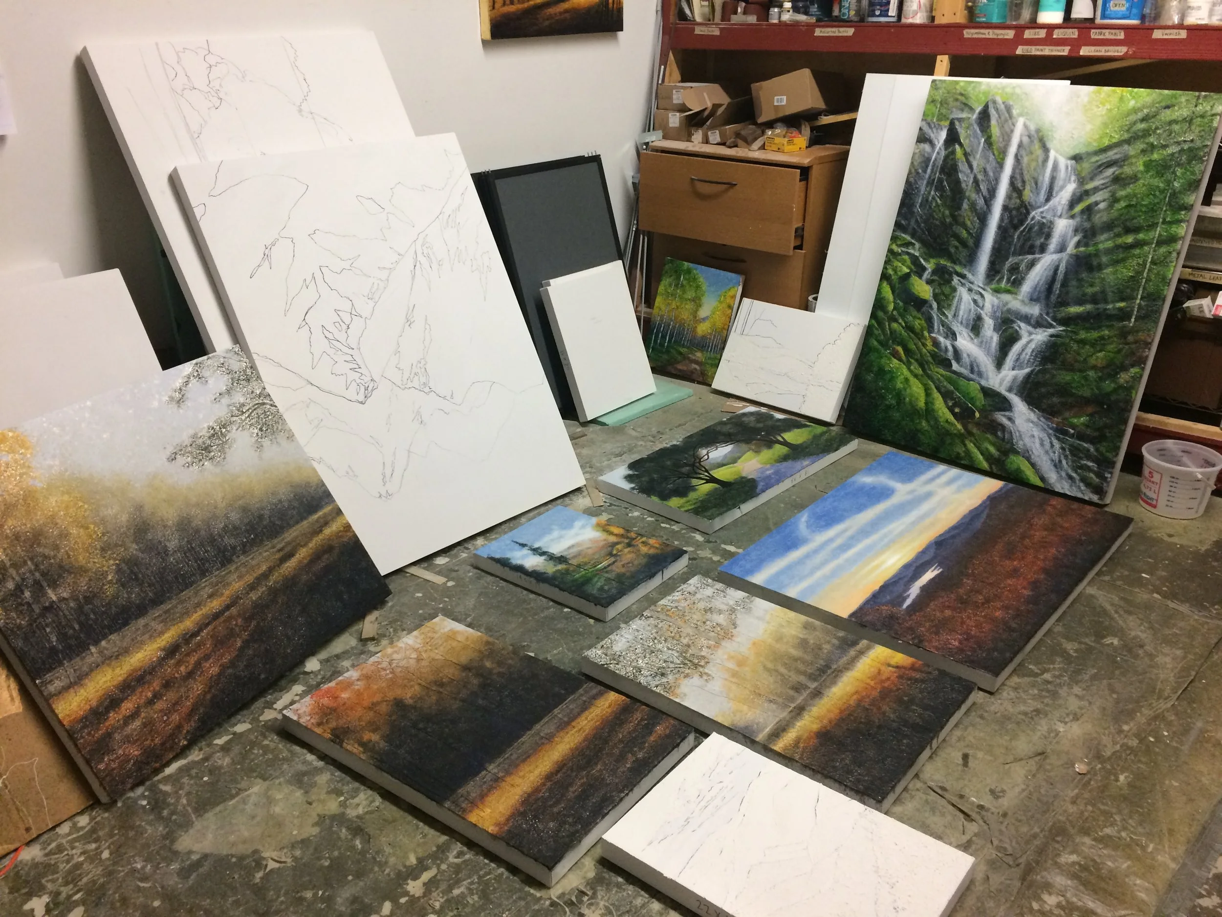
A few weeks ago, I hiked a short stretch of the Appalachian Trail—not the whole thing, just a few miles, but enough to feel something shift. I didn’t go with a plan, really. I just packed my water, a small sketchbook, and hit the trail early in the morning, hoping to clear my head. What I didn’t expect was how much that walk would quietly reshape the way I paint.
There’s a rhythm to walking through the woods. Footstep after footstep, heartbeat steady, breath syncing with the rise and fall of the trail. I found myself noticing things I usually pass by—a single red leaf clinging to a branch, the soft decay of mossy logs, the shimmer of morning light through mist. Each detail felt like its own painting.
When I got home, I couldn’t shake that feeling. Instead of rushing to paint something “impressive,” I started working slower, letting my brush follow the same kind of quiet pace I had on the trail. The work became more about atmosphere and feeling than precision. My colors shifted—more earth tones, more soft transitions. I wanted the viewer to feel what I felt out there: stillness, awe, and a gentle sense of presence.
That short hike reminded me that art doesn’t always come from pushing harder. Sometimes it’s about stepping back, getting quiet, and letting the world come to you. The trail gave me that. And now, every time I paint, I try to carry a little piece of that forest with me. Just a few miles—but they went a long way.
Go Take a Walk!
There’s something magical about taking a walk in the woods early in the morning. When the world is still quiet and the sun is just beginning to filter through the trees, everything feels a little more open—especially my mind. It’s during these moments, with no distractions and no pressure, that I feel the most creatively free.
In the woods, the noise of everyday life fades away. There are no emails to answer, no deadlines to meet—just the sound of birds waking up, leaves whispering in the breeze, and my own footsteps on the trail. It’s a kind of peace I don’t find anywhere else, and it gives my mind the space it needs to breathe. With that space, new ideas seem to come more easily, almost effortlessly. Thoughts connect in unexpected ways, and I often find myself inspired by the simplest things—a pattern of light, the texture of bark, or the way the air smells after it rains.
I’ve noticed that walking in nature helps clear out the mental clutter. The things I’ve been stuck on or overthinking suddenly don’t feel so heavy. My brain resets a little, and with that comes a fresh wave of creativity. Whether I’m writing, sketching, or just trying to solve a problem, the woods always help me see things from a new angle.
I’ve noticed that walking in nature helps clear out the mental clutter.
What’s even more special is the time alone with my thoughts. Out there, it’s just me and the trees, and something about that allows me to dig a little deeper. I get more honest with myself, and that honesty feeds my creative work in a big way. It’s like I can hear my own voice more clearly, without all the noise.
So for me, a walk in the woods isn’t just a walk. It’s a reset, a source of inspiration, and a reminder that creativity doesn’t have to be forced—it just needs room to grow.
In morning light, the forest wakes,
A hush beneath the pine and brakes.
The world falls quiet, thoughts run free,
As whispers drift from tree to tree.
Each leaf, a spark; each breeze, a guide,
To places hiding deep inside.
The path unwinds, the clutter clears,
Ideas bloom where once were fears.
No screens, no noise, just earth and air,
And sudden truth found everywhere.
In solitude, I find my start—
The woods redraw the map of heart.
A walk, but more—a sacred space,
Where stillness makes the mind embrace
Its wildest, truest, untamed grace.
Periods of Art: Mannerism
The Mannerism period of art history emerged in the late Renaissance, around the early 16th century, and lasted until the beginning of the Baroque period in the early 17th century. It developed as a reaction to the harmonious ideals and balanced compositions of High Renaissance masters such as Leonardo da Vinci, Raphael, and Michelangelo. Instead of striving for ideal beauty and naturalism, Mannerist artists embraced complexity, artificiality, and exaggeration.
Mannerism is characterized by elongated proportions, distorted poses, and ambiguous spatial environments. Figures often appear in unnatural, contorted positions, with exaggerated elegance and tension. Rather than focusing on calm, rational compositions, Mannerist works are often dramatic and emotionally charged, pushing the boundaries of proportion and perspective.
The movement originated in Italy, particularly in Florence and Rome, and was heavily influenced by the later works of Michelangelo, whose muscular, twisting figures and intense emotion were admired and imitated. Key figures of Mannerism include Jacopo Pontormo, Rosso Fiorentino, Parmigianino, and later, El Greco. Parmigianino’s Madonna with the Long Neck is a prime example of the style, with its unnaturally elongated figures and spatial ambiguity.
Mannerism also reflected the cultural and religious turmoil of the time, including the Reformation and the sack of Rome in 1527. These events contributed to a sense of instability and uncertainty, which was mirrored in the art. Unlike the confident, orderly world of the High Renaissance, Mannerism often conveyed anxiety, tension, and complexity.
Although initially criticized for its departure from classical ideals, Mannerism has come to be appreciated for its innovation, emotional depth, and bold experimentation. It served as a bridge between the perfection of the Renaissance and the dramatic flair of the Baroque, leaving a lasting impact on the trajectory of Western art.
Finding Meaning in the Abstract: Pointers for Understanding Modern Art

Modern art can feel like a mystery—like you’re being let in on a joke but no one’s actually explaining the punchline. I used to walk through contemporary galleries feeling like I was missing something important. A canvas covered in one solid color or a sculpture made of tangled wires didn’t look like “art” in the traditional sense. But over time, I realized that understanding modern art isn’t about decoding a secret language—it’s about learning to see differently.
One of the biggest shifts for me came when I stopped asking, “What is this supposed to be?” and started asking, “What is this trying to make me feel?” Modern art often moves away from realistic representation. Instead of painting a tree, an artist might evoke the feeling of standing in a forest through texture, color, and shape. Once I gave myself permission to respond emotionally rather than analytically, things started clicking.
“What is this trying to make me feel?”
Another helpful pointer is to read the artist’s statement or title when available. It’s not cheating—it’s context. These often give you a glimpse into the artist’s mind and the world they were responding to. Modern art is deeply tied to the time and place it was created. A chaotic painting might reflect social unrest; a minimalist piece might be pushing back against visual overload.
Also, don't underestimate your own interpretation. The beauty of modern art is that it invites participation. There isn’t always one “correct” meaning. If a piece reminds you of something personal or stirs a memory, that response is valid—and probably just as valuable as the artist’s intention.
Finally, give it time. Let yourself sit with the discomfort of not knowing. Some pieces won’t resonate, and that’s okay. But others might stay with you longer than you expect, slowly unfolding their meaning.
Modern art challenged how I thought art “should” look, but it also taught me that art doesn’t have to look a certain way to be powerful. It just has to make you feel something—and once you approach it with curiosity instead of judgment, the whole experience becomes a lot more rewarding.
To Art: a Poem
O muse of art, thou vision born of perfect grace,
A lady fair, whose beauty none can name,
Thy gentle hands do carve in time a place
Where all that’s bright is born from thy pure flame.
With every stroke, thou paint'st the perfect dream,
Thy lips untouched, yet whispering soft and true,
Each curve and line a tale that dares to gleam
As though the very stars had seen thee through.
Thy eyes, a mirror of the heaven's light,
A depth so vast no mortal heart could hold,
Thy form, a vision born of endless night,
Where shadows breathe and secrets do unfold.
Thy skin, as soft as petals kissed by rain,
Thy spirit, woven deep in every hue,
Thy touch, a balm that heals all earthly pain,
A quiet force that stirs the soul anew.
Thy colors weave a love, both soft and bright,
Like evening's glow upon the setting sea;
Thy gaze a mirror of the starry night,
In thee, all passions find their sanctuary.
Thy hands, with grace, do mold a world divine,
Where dreams take shape and memory takes flight.
Thy voice, unspoken, fills the heart’s design,
And we, the watchers, yield to pure delight.
In thee, O Art, we see all beauty born—
As stars that glisten on the velvet sea,
As roses kissed by the first light of dawn,
As love itself, too deep for eyes to see.
Thy soul, transcendent, whispers like the breeze,
A muse eternal, floating in the night,
Thy art, a flame that kindles hearts with ease,
A beauty ever vivid, ever bright.
"What was it like going to art school?"
I was asked recently about my own experience at art school. Actually, I attended a Design school, and though art was a large part of the training, the education at Art Center College of Design was much more extensive than just art. Attending Art Center College of Design in Pasadena, California, really was one of the most unforgettable chapters of my life. Out of all the memories I made during my time there, one experience stands out above the rest—the collaborative design project in my third term.
That project was part of a transdisciplinary course where students from different design backgrounds, like graphic design, industrial design, and interaction design, teamed up. Our goal was to come up with a product that would make urban life better. Working with such a talented and diverse group of people opened my eyes to new ways of thinking and solving problems. Each person brought something unique to the table, and that blend of creativity was electric.
“(this was) really was one of the most unforgettable chapters of my life…”
Our team landed on the idea of creating a modular public seating system that could adapt to different urban spaces. I focused on the visual branding and user interface, while my teammates handled product engineering and environmental design. We hit some roadblocks trying to balance style with function, but we worked through every challenge together, determined to make something both beautiful and practical.
What made the experience even more special was the feedback we got from our instructors and visiting professionals. Their honest critiques pushed us to keep improving and paying attention to every little detail. Art Center had this way of demanding the best from us, and it made us better designers.
The day we presented our final prototype at the end-of-term showcase was one I’ll never forget. Seeing our hard work come to life and hearing positive reactions from our peers and industry pros made it all worth it. It was a real reminder of how design can shape the world around us.
That project at Art Center didn’t just sharpen my design skills—it taught me the value of teamwork, resilience, and staying open to new ideas. It was a perfect example of what Art Center stands for: excellence, innovation, and pushing creative boundaries. Those lessons and memories will stay with me wherever my career takes me.
Why I Love the Rococo Period

The Rococo period has always fascinated me. There’s something about its elegance, soft colors, and playful charm that makes it feel almost dreamlike. Emerging in the early 18th century, Rococo was a reaction to the grandeur and seriousness of the Baroque era. Instead of dark, dramatic themes, Rococo artists embraced lightness, romance, and beauty. Their work feels like an escape into a world of luxury and fantasy, and that’s exactly why I love it.
One of my favorite things about Rococo art is its attention to detail. Artists like Jean-Honoré Fragonard and François Boucher created paintings filled with soft pastels, flowing fabrics, and delicate brushstrokes. Their scenes often depicted aristocrats lounging in lush gardens, playful love affairs, or even mythological figures surrounded by golden light. Looking at their work feels like stepping into a fairy tale—one filled with music, laughter, and endless beauty.
One of my favorite things about Rococo art is its attention to detail.
But Rococo wasn’t just about paintings. It influenced everything from architecture to fashion. Ornate furniture, gilded mirrors, and intricate ceiling frescoes filled the homes of the wealthy, making everyday life feel like a work of art. Even today, you can see traces of Rococo style in modern design, proving that its charm never truly faded.
For me, Rococo is more than just an art movement—it’s a reminder that art can be lighthearted, joyful, and enchanting. In a world that often feels heavy, sometimes we all need a little Rococo magic to brighten our day.
Whirls of gold and light,
Soft pastels and joy take flight,
Elegance in bloom.
Blog Archive
-
2026
- Jun 8, 2026 Conversations Across Time: Peter Paul Rubens Jun 8, 2026
- Apr 29, 2026 Conversations Across Time: Caravaggio Apr 29, 2026
- Apr 26, 2026 Conversations Across Time: Raphael Apr 26, 2026
- Apr 21, 2026 Conversations Across Time: Michelangelo Apr 21, 2026
- Apr 16, 2026 Conversations Across Time: Sandro Botticelli Apr 16, 2026
- Apr 11, 2026 Conversations Across Time: Donatello Apr 11, 2026
- Apr 6, 2026 Conversations Across Time: Jan van Eyck Apr 6, 2026
- Apr 1, 2026 Conversations Across Time: Leonardo da Vinci Apr 1, 2026
- Mar 29, 2026 A Closing Reflection: Nine Ways Beauty Finds Us Mar 29, 2026
- Mar 27, 2026 Type Nine: The Recognition of Wholeness Mar 27, 2026
- Mar 24, 2026 Type Eight: The Encounter with Unfiltered Reality Mar 24, 2026
- Mar 18, 2026 Type Seven: The Pursuit of Radiant Possibility Mar 18, 2026
- Mar 16, 2026 Type Six: Beauty as Trust, Stability, and the Restoration of Ground Mar 16, 2026
- Mar 11, 2026 Type Five: Beauty as Insight and Essential Understanding Mar 11, 2026
- Mar 8, 2026 Type Four: Beauty as Identity and Emotional Truth Mar 8, 2026
- Mar 5, 2026 Type Three: Beauty as Significance and Radiance Mar 5, 2026
- Mar 1, 2026 Type Two: Beauty as Loving Connection Mar 1, 2026
- Feb 26, 2026 Type One: The Pursuit of Perfected Beauty Feb 26, 2026
- Feb 22, 2026 Why Personality Shapes the Way We Create and Experience Art Feb 22, 2026
- Feb 11, 2026 My Most Ambitious Project to Date: Pont Neuf at Dusk Feb 11, 2026
- Feb 8, 2026 The Human Rhythm: Why the Golden Section Matters Feb 8, 2026
- Jan 31, 2026 Nature’s Quiet Mathematics: The Golden Section at Work Jan 31, 2026
- Jan 24, 2026 The Golden Section in Architecture: Building with Human Scale Jan 24, 2026
- Jan 16, 2026 The Golden Section in Music: Proportions You Can Feel Jan 16, 2026
- Jan 14, 2026 The Golden Ratio in Art: Where Math Meets Beauty Jan 14, 2026
-
2025
- Dec 25, 2025 Finding Peace in the Christmas Chaos Dec 25, 2025
- Dec 14, 2025 Seeing Meaning: How Medieval Art Spoke Without Words Dec 14, 2025
- Nov 19, 2025 The Matterhorn and the Magic of Transformation Nov 19, 2025
- Nov 13, 2025 Commissions vs Completed Pieces…Which is Right for You? Nov 13, 2025
- Oct 28, 2025 What can I learn from Makoto Fujimura in 2025? Oct 28, 2025
- Oct 12, 2025 What can I learn from Pablo Picasso in 2025? Oct 12, 2025
- Oct 10, 2025 What can I learn from Raphael in 2025? Oct 10, 2025
- Oct 8, 2025 What can I learn from Georgia O’Keefe in 2025? Oct 8, 2025
- Sep 28, 2025 What can I learn from Caravaggio in 2025? Sep 28, 2025
- Jul 25, 2025 What can I learn from Thomas Gainsborough in 2025? Jul 25, 2025
- Jul 20, 2025 What can I learn from Leonardo da Vinci in 2025? Jul 20, 2025
- Jul 15, 2025 What can I learn from Michelangelo in 2025? Jul 15, 2025
- Jul 2, 2025 What can I learn from Van Gogh in 2025? Jul 2, 2025
- Jun 25, 2025 What can I learn from Renoir in 2025? Jun 25, 2025
- Jun 23, 2025 What can I learn from Claude Monet in 2025? Jun 23, 2025
- Jun 21, 2025 Using Complimentary Colors for Shading Jun 21, 2025
- Jun 17, 2025 How and When to use Complimentary Colors Jun 17, 2025
- May 30, 2025 Perspective in Art 101: How to Make Your Drawings Pop Off the Page May 30, 2025
- May 26, 2025 How to Really Understand Medieval Art May 26, 2025
- May 22, 2025 Staying Creative May 22, 2025
- May 10, 2025 AT Experience May 10, 2025
- May 3, 2025 Go Take a Walk! May 3, 2025
- Apr 25, 2025 Periods of Art: Mannerism Apr 25, 2025
- Apr 17, 2025 Finding Meaning in the Abstract: Pointers for Understanding Modern Art Apr 17, 2025
- Apr 16, 2025 The Quiet Labor Apr 16, 2025
- Apr 12, 2025 To Art: a Poem Apr 12, 2025
- Apr 5, 2025 The Enchantment of Art Nouveau Apr 5, 2025
- Mar 23, 2025 "What was it like going to art school?" Mar 23, 2025
- Mar 18, 2025 Why I Love the Rococo Period Mar 18, 2025
- Mar 4, 2025 Expressing Joy Through Art Mar 4, 2025
- Feb 28, 2025 The Connection Between Art and Frustration Feb 28, 2025
- Feb 23, 2025 Neoclassicism: Bringing Ancient Style Back to Life Feb 23, 2025
- Feb 18, 2025 On my walk Feb 18, 2025
- Feb 12, 2025 Art at the Very Beginning Feb 12, 2025
- Feb 10, 2025 Monet and Renoir: A Personal Reflection on Their Differences Feb 10, 2025
- Feb 6, 2025 The Fount of Creation: A poem Feb 6, 2025
- Feb 1, 2025 The Connection Between Art and Grief Feb 1, 2025
- Jan 29, 2025 A Journey Through Medieval Art: Stories from the Middle Ages Jan 29, 2025
- Jan 26, 2025 The Story of Art: The Romantic Period Jan 26, 2025
- Jan 16, 2025 The Relationship Between Music and Painting Jan 16, 2025
- Jan 12, 2025 Periods of Art: Baroque Jan 12, 2025
- Jan 11, 2025 Marketing your Artwork Jan 11, 2025
- Jan 7, 2025 Exploring the Golden Ratio in Art Jan 7, 2025
- Jan 3, 2025 Artistic Enlightenment: Lessons from Italy Jan 3, 2025
-
2024
- Dec 29, 2024 Why Travel is Crucial for Unleashing Creativity Dec 29, 2024
- Dec 22, 2024 Steps to Becoming a Full-Time Professional Artist Dec 22, 2024
- Dec 10, 2024 How to Determine Subject Matter for Your Next Painting Dec 10, 2024
- Dec 3, 2024 My Favorite Artist Dec 3, 2024
- Dec 1, 2024 Creativity and Exploration Dec 1, 2024
- Nov 13, 2024 Impressionistic Heroes of Mine Nov 13, 2024
- Nov 10, 2024 "So how do you DO this?" Nov 10, 2024
- Nov 3, 2024 Discovering the Bond Between Nature and Art Nov 3, 2024
- Nov 1, 2024 How Art Can Help Us Cope with Stress Nov 1, 2024
- Oct 27, 2024 How to Select the Perfect Art for Your Home Oct 27, 2024
- Oct 24, 2024 What to Do When You Feel Like Giving Up as an Artist Oct 24, 2024
- Oct 14, 2024 Book Review: The Artist’s Way Oct 14, 2024
- Oct 11, 2024 How to find Inspiration for your art Oct 11, 2024
- Sep 24, 2024 Crafting the Perfect Title for Your Artwork Sep 24, 2024
- Sep 14, 2024 The Worst Advice I’ve Ever Received as an Artist Sep 14, 2024
- Sep 8, 2024 Overcoming Artist’s Block: Practical Tips Sep 8, 2024
- Aug 30, 2024 Exploring Lessons from Vincent van Gogh Aug 30, 2024
- Aug 29, 2024 Why Purchase Original Artwork? Aug 29, 2024
- Aug 25, 2024 How do you determine the best size artwork to purchase? Aug 25, 2024
- Aug 15, 2024 "So, what's this painting worth?" Aug 15, 2024
- Aug 9, 2024 What color art would go best in my home? Aug 9, 2024
- Aug 4, 2024 How to deal with criticism as an artist Aug 4, 2024
- Mar 27, 2024 Question 12: "What do you do when you have a mental block?" Mar 27, 2024
- Mar 27, 2024 New Goals + Winter Months = "Outside the Box" Creativity Mar 27, 2024
- Jan 8, 2024 Question 11: Where do you get inspiration for your work? Jan 8, 2024
-
2023
- Sep 11, 2023 Question 10: "Do you have your work in galleries?" Sep 11, 2023
- Aug 27, 2023 Question 9: "How do you manage the business side of your art business?" Aug 27, 2023
- Aug 20, 2023 Question 8: "Do you advertise?" Aug 20, 2023
- Aug 13, 2023 Question 7: "How do you price your work?" Aug 13, 2023
- Jul 30, 2023 Question 6: "What are the positive points and negative points about having an 'open studio'?" Jul 30, 2023
- Jul 19, 2023 Question 5: "Would you mind critiquing my work at some point?" Jul 19, 2023
- Jul 1, 2023 Question 4: "Would you recommend art school, and if so, how would you find the right one?" Jul 1, 2023
- Jun 24, 2023 Question 3: "Did you go to art school? If so, where?" Jun 24, 2023
- Jun 16, 2023 Question 2: "How long have you been selling your work professionally?" Jun 16, 2023
- Jun 10, 2023 Question 1..."How long have you been an artist?" Jun 10, 2023
- Jun 4, 2023 So, you're thinking about art as a career? Jun 4, 2023
- Mar 3, 2023 "What inspires you as an artist?" Mar 3, 2023
- Feb 15, 2023 Should I buy a completed painting OR commission a painting? Feb 15, 2023
- Jan 23, 2023 "How do you Price Your Work?" Jan 23, 2023
-
2022
- Dec 1, 2022 An Artist in Italy (Part 3) Dec 1, 2022
- Nov 16, 2022 An Artist in Italy (Part 2) Nov 16, 2022
- Nov 8, 2022 An Artist in Italy (Part 1) Nov 8, 2022
- Oct 10, 2022 When Remodeling a Home... Oct 10, 2022
- Aug 22, 2022 How to Handle Failure Aug 22, 2022
- Jun 3, 2022 "What is it like being an artist these days?" Jun 3, 2022
- May 21, 2022 "Are All Artists Introverts?" May 21, 2022
- May 9, 2022 What Makes a Painting a Good Piece of Art? May 9, 2022
- Apr 1, 2022 The Story Behind…"Gentle Showers on a Summer Afternoon" Apr 1, 2022
- Mar 19, 2022 The Story Behind..."Blue Ridge Summer Afternoon" Mar 19, 2022
- Feb 18, 2022 Your Opinion Please... Feb 18, 2022
- Jan 22, 2022 What's in a Compliment? Jan 22, 2022
-
2021
- Dec 25, 2021 My Christmas Present to Joy Dec 25, 2021
- Dec 12, 2021 Deep in the Heart Dec 12, 2021
- Nov 29, 2021 "How do you know you're done with a painting?" Nov 29, 2021
- Nov 1, 2021 Does it Matter What Other People Think of My Art? Nov 1, 2021
- Oct 12, 2021 Creatively Inhaling... Oct 12, 2021
- Aug 31, 2021 More Fun than I Know What to do With Aug 31, 2021
- Aug 13, 2021 “Are You Self Taught?” Aug 13, 2021
- Jul 21, 2021 New Art Gallery on the West Coast Jul 21, 2021
- Jun 23, 2021 "Art from the Heart" vs "Commissioned Art" Jun 23, 2021
- May 28, 2021 More Questions and Answers May 28, 2021
- May 17, 2021 What does Diversity have to do with honest artwork? May 17, 2021
- May 4, 2021 More Questions and Answers May 4, 2021
- Apr 30, 2021 Questions and Answers Apr 30, 2021
- Apr 16, 2021 And the Next Blog Post is... Apr 16, 2021
- Mar 10, 2021 How do you create when you don't feel like creating? Mar 10, 2021
- Feb 11, 2021 "Mullaghmore": The Story Behind the Painting Feb 11, 2021
- Jan 28, 2021 A Look Back to "The Dark Year" Jan 28, 2021
- Jan 17, 2021 Studio Expansion...Hello Northeast! Jan 17, 2021
- Jan 7, 2021 How to Create the Perfect Painting Jan 7, 2021
-
2020
- Dec 1, 2020 A personal answer to a personal question... Dec 1, 2020
- Nov 4, 2020 Using Art to Express my Politics Nov 4, 2020
- Oct 16, 2020 Sometimes, just "having fun" is a good enough reason Oct 16, 2020
- Oct 4, 2020 The Best Painting Delivery Ever... Oct 4, 2020
- Sep 7, 2020 How a Dinky Little Virus Changed my Art Business Sep 7, 2020
- Aug 9, 2020 Adaptation: Survival of the Most Flexible Aug 9, 2020
- Aug 3, 2020 Story Behind the Painting: "Sundown over the Blue Ridge" Aug 3, 2020
- Jul 18, 2020 Cure for Covid blues Jul 18, 2020
- Jul 5, 2020 Where Does it Take You? Jul 5, 2020
- Jun 3, 2020 Story Behind the Painting: Autumn Day on the French Broad River Jun 3, 2020
- May 24, 2020 Story Behind the Painting: Saint-Jean-Cap-Ferrat May 24, 2020
- Apr 30, 2020 Q&A: SESSION TWO Apr 30, 2020
- Apr 22, 2020 Q&A: SESSION ONE Apr 22, 2020
- Apr 8, 2020 What I'll Miss When This Pandemic is Over... Apr 8, 2020
- Mar 20, 2020 Entertaining Angels Unawares Mar 20, 2020
- Mar 8, 2020 In Celebration of Art Mar 8, 2020
- Feb 27, 2020 "The Bridge" Feb 27, 2020
- Feb 8, 2020 The Most Interesting Question of the Year (but it's only February so...) Feb 8, 2020
- Jan 29, 2020 "Can I Watch You?" Jan 29, 2020
- Jan 14, 2020 From Point A to Point Z Jan 14, 2020
- Jan 5, 2020 An Impractical Idea Jan 5, 2020
-
2019
- Dec 17, 2019 My Beautiful Baby on Display Dec 17, 2019
- Dec 3, 2019 Regarding the Selection of an Artistic Theme Dec 3, 2019
- Nov 20, 2019 "What's Your Best Price on This Piece?" Nov 20, 2019
- Nov 13, 2019 A Really Unique Commission Project Nov 13, 2019
- Nov 6, 2019 Fun with Art Scammers Nov 6, 2019
- Nov 3, 2019 "How did you know you wanted to be an artist?" Nov 3, 2019
- Oct 30, 2019 How do you know when a painting is "done"? Oct 30, 2019
- Oct 20, 2019 The piece I had to paint: "Côte d’Azur" Oct 20, 2019
- Oct 18, 2019 Inspiration Everywhere! Oct 18, 2019
- Aug 26, 2019 Contentment vs Restlessness Aug 26, 2019
- Aug 14, 2019 "Why Should I Purchase Artwork?" Aug 14, 2019
- Aug 11, 2019 What Was Art School Like? Aug 11, 2019
- Aug 7, 2019 "The Four Seasons on the French Broad River" Aug 7, 2019
- Jul 30, 2019 Joy Unspeakable Jul 30, 2019
- Jul 7, 2019 Of Mountains and Oceans Jul 7, 2019
- Jul 3, 2019 Lessons I've Learned as an Artist Jul 3, 2019
- Jun 26, 2019 St.Claire Art Opening at the AC Hotel, Asheville Jun 26, 2019
- Jun 23, 2019 "How do you decide what to paint?" Jun 23, 2019
- Jun 5, 2019 One of my All-Time Heroes Jun 5, 2019
- Jun 2, 2019 Regarding "Inspiration" vs "Necessity" Jun 2, 2019
- May 29, 2019 The Best Complement I've Ever Received May 29, 2019
- May 19, 2019 "What are you Working on These Days?" May 19, 2019
- May 5, 2019 "Frankenstein-ing" a painting May 5, 2019
- Apr 17, 2019 The Big Reveal Apr 17, 2019
- Apr 3, 2019 "How do you Decide What to Paint?" Apr 3, 2019
- Mar 27, 2019 "I'm just not making the sales I need!" Mar 27, 2019
- Mar 20, 2019 Making the Most of Mistakes Mar 20, 2019
- Mar 10, 2019 Exploring Austin Galleries, Part 2 Mar 10, 2019
- Feb 25, 2019 Exploring Austin Galleries, Part 1 Feb 25, 2019
- Feb 10, 2019 Progress! Feb 10, 2019
- Jan 23, 2019 Preliminary Photos of my "Sails" Prototypes Jan 23, 2019
- Jan 16, 2019 The Benefits of Slowing Down Jan 16, 2019
- Jan 8, 2019 New Idea Taking Shape Jan 8, 2019
-
2018
- Dec 29, 2018 Looking Back and Looking Ahead Dec 29, 2018
- Dec 19, 2018 Percolating Creativity Dec 19, 2018
- Dec 16, 2018 So then... Dec 16, 2018
- Dec 12, 2018 What if... Dec 12, 2018
- Dec 5, 2018 Recent Projects on my Plate Dec 5, 2018
- Dec 3, 2018 Claude: My Creative Hero and Muse Dec 3, 2018
- Nov 22, 2018 Lessons I've Learned as an Artist Nov 22, 2018
- Nov 12, 2018 Planning for a Second Studio Location! Nov 12, 2018
- Nov 7, 2018 Steps Involved with a Painting Commission Nov 7, 2018
- Nov 4, 2018 How do you stay "balanced"? Nov 4, 2018
- Oct 28, 2018 What makes art "Art"? Oct 28, 2018
- Oct 21, 2018 "How Did You Stumble Across This Type of Artwork?" Oct 21, 2018
- Oct 17, 2018 "A Personal History" Oct 17, 2018
- Oct 14, 2018 Commission Confusion Oct 14, 2018
- Oct 10, 2018 "Aqueous Dream" Oct 10, 2018
- Oct 7, 2018 Beauty in the Center of the Pit Oct 7, 2018
- Sep 30, 2018 Only North Carolina? Sep 30, 2018
- Sep 23, 2018 The Price of Being a Landscape Painter Sep 23, 2018
- Sep 9, 2018 Thoughts on New Directions, New Possibilities Sep 9, 2018
- Aug 29, 2018 SURVEY: GLOSSY OR SATIN Aug 29, 2018
- Aug 22, 2018 Regarding Commissioning a Painting Aug 22, 2018
- Aug 19, 2018 On the Brink of a Huge Failure Aug 19, 2018
- Aug 7, 2018 "The Trail That Never Ends" Aug 7, 2018
- Aug 5, 2018 Inspration Begets Inspiration Aug 5, 2018
- Jul 19, 2018 Rejuvenating Creativity! Jul 19, 2018
- Jul 15, 2018 A Word About Accolades Jul 15, 2018
- Jul 10, 2018 Where it Began Jul 10, 2018
- Jul 4, 2018 Funny Things People Say in an Art Studio Jul 4, 2018
- Jun 29, 2018 "The Time Between Times" Jun 29, 2018
- Jun 27, 2018 World View #8: Post Modernism Jun 27, 2018
- Jun 21, 2018 World View #7: New Age Pantheism Jun 21, 2018
- Jun 12, 2018 A New Opportunity -- A New Idea Jun 12, 2018
- Jun 6, 2018 The Art of Dinner (at the Grove Park Inn) Jun 6, 2018
- Jun 3, 2018 National Geographic?!? Jun 3, 2018
- Jun 1, 2018 World View #6: Modernism Jun 1, 2018
- May 24, 2018 The Art of Dinner (with the Dallas Cowboys) May 24, 2018
- May 13, 2018 Carving Mountains from Scratch May 13, 2018
- May 10, 2018 "Trigger Warning" May 10, 2018
- May 7, 2018 World View #5: Existentialism May 7, 2018
- Apr 29, 2018 World View #4: Nihilism Apr 29, 2018
- Apr 11, 2018 World View #3: Naturalism Apr 11, 2018
- Apr 4, 2018 World View #2: Deism Apr 4, 2018
- Mar 26, 2018 World View #1: Theism Mar 26, 2018
- Mar 23, 2018 A Time to be Disturbed Mar 23, 2018
- Mar 14, 2018 Understanding Art 101 Mar 14, 2018
- Mar 8, 2018 The Organ Mountains Mar 8, 2018
- Mar 7, 2018 "Remember...there are no mistakes with art" Mar 7, 2018
- Mar 2, 2018 The Biltmore Estate Mar 2, 2018
- Feb 21, 2018 How to Make a Living as an Artist (Part 2) Feb 21, 2018
- Feb 12, 2018 How to Make a Living as an Artist Feb 12, 2018
- Feb 4, 2018 How do you create when you don't feel creative? Feb 4, 2018
- Jan 24, 2018 Gallery Representation in Hendersonville! Jan 24, 2018
- Jan 19, 2018 Metalizing the Biltmore Estate Jan 19, 2018
- Jan 15, 2018 Four Seasons on the Blue Ridge Jan 15, 2018
- Jan 11, 2018 About Ice... Jan 11, 2018
- Jan 10, 2018 What's Next? Jan 10, 2018
-
2017
- Dec 20, 2017 Mountain Top Experiences Dec 20, 2017
- Dec 18, 2017 The Power of Mystery Dec 18, 2017
- Dec 7, 2017 Forsyth Park Fountain Dec 7, 2017
- Dec 6, 2017 Angsty or Terrified? Dec 6, 2017
- Dec 4, 2017 To the "Angsty" Artist... Dec 4, 2017
- Dec 3, 2017 "I woudn't pay HALF of what he's asking!" Dec 3, 2017
- Nov 20, 2017 "On the Water" Nov 20, 2017
- Nov 19, 2017 Song of Autumn Nov 19, 2017
- Nov 15, 2017 "Top of the Mountain" Nov 15, 2017
- Nov 5, 2017 "How do you decide what to paint?" Nov 5, 2017
- Nov 2, 2017 "Valley of Shadows" Nov 2, 2017
- Nov 1, 2017 Forest of Autumn Gold Nov 1, 2017
- Oct 25, 2017 Then and Now Oct 25, 2017
- Oct 24, 2017 Catawba Falls Oct 24, 2017
- Oct 18, 2017 "Valley of Shadows" Oct 18, 2017
- Oct 11, 2017 Autumn River Song Oct 11, 2017
- Oct 3, 2017 Autumnal Shift Oct 3, 2017
- Sep 28, 2017 Mystic Summer Morning Sep 28, 2017
- Sep 24, 2017 Valley of Shadows Sep 24, 2017
- Sep 1, 2017 the breakers Sep 1, 2017
- Aug 24, 2017 When the Sun Went Dark Aug 24, 2017
- Aug 17, 2017 Secret Blog Post Aug 17, 2017
- Aug 14, 2017 Waterfalls Everywhere! Aug 14, 2017
- Aug 11, 2017 "Cullasaja Falls" Completion photo Aug 11, 2017
- Aug 8, 2017 Finishing up "My Marathon" Aug 8, 2017
- Aug 1, 2017 One of the Best Days Ever! Aug 1, 2017
- Jul 26, 2017 "Glacial Fractures in situ" Jul 26, 2017
- Jul 24, 2017 Inspiration and Rest Jul 24, 2017
- Jul 18, 2017 Half Baked Ideas... Jul 18, 2017
- Jul 13, 2017 Oaks on the Water Jul 13, 2017
- Jul 9, 2017 Challenged to the Core Jul 9, 2017
- Jul 5, 2017 Boats on the Water Jul 5, 2017
- Jun 30, 2017 Glacial Fractures Jun 30, 2017
- Jun 29, 2017 Winter in the Summer! Jun 29, 2017
- Jun 27, 2017 What's in a Compliment? Jun 27, 2017
- Jun 23, 2017 Thoughts on a Mighty Failure Jun 23, 2017
- Jun 20, 2017 Sunrise on the Mountain Jun 20, 2017
- Jun 14, 2017 The Last Sunset (is that dramatic or what?) Jun 14, 2017
- Jun 12, 2017 Sunset or Sunrise? End or Beginning? Jun 12, 2017
- Jun 9, 2017 At the End of the Day Jun 9, 2017
- Jun 8, 2017 Giverny: My Homage to the Man Jun 8, 2017
- Jun 2, 2017 A Funny Thing Happened at the Studio Today... Jun 2, 2017
- Jun 2, 2017 Sunrise, Sunset... Jun 2, 2017
- May 29, 2017 Color Explosion May 29, 2017
- May 22, 2017 My Largest Painting to Date... May 22, 2017
- May 18, 2017 What to do with 2000 visitors in an art studio... May 18, 2017
- May 9, 2017 My Creative Muse May 9, 2017
- May 3, 2017 Joys of Life May 3, 2017
- Apr 28, 2017 Regarding Art & Beauty Apr 28, 2017
- Apr 25, 2017 Getting Better Acquainted Apr 25, 2017
- Apr 23, 2017 Rainy Sunday Morning Thoughts Apr 23, 2017
- Apr 22, 2017 Personal Thoughts Apr 22, 2017
- Apr 19, 2017 Favorite Hikes (Inspiration in the Making)... Apr 19, 2017
- Apr 15, 2017 Inspiration is Everywhere (some of our favorite hiking trails) Apr 15, 2017
- Apr 9, 2017 "Where should we eat tonight?" Apr 9, 2017
- Apr 6, 2017 Who Else Should We See in the District? Apr 6, 2017
- Apr 1, 2017 Spring in Western North Carolina Apr 1, 2017
- Mar 29, 2017 "Can you really make a living here?" Mar 29, 2017
- Mar 25, 2017 Of Ruination and Rescue Mar 25, 2017
- Mar 21, 2017 How I decide what to paint... Mar 21, 2017
- Mar 18, 2017 Musings of an artist... Mar 18, 2017
- Mar 14, 2017 Winter thoughts Mar 14, 2017
- Mar 13, 2017 "What makes this painting so sparkly?" Mar 13, 2017
- Mar 10, 2017 You're From Where? Mar 10, 2017
- Mar 5, 2017 "No Boundaries" Mar 5, 2017
- Mar 3, 2017 Appalachian Trail Mar 3, 2017
- Mar 2, 2017 What is 'good' art? Mar 2, 2017
- Feb 26, 2017 A Trip to the Art Museum Feb 26, 2017
- Feb 23, 2017 "The Rules" of Art Feb 23, 2017
- Feb 15, 2017 To School or Not to School... Feb 15, 2017
- Feb 10, 2017 How Do I Start This Thing? Feb 10, 2017
- Feb 9, 2017 Rocky Mountains reflection Feb 9, 2017
- Feb 7, 2017 Getting Inspired Feb 7, 2017
- Feb 5, 2017 Inspiration for a painting... Feb 5, 2017
- Jan 31, 2017 Understanding Abstract Art Jan 31, 2017
- Jan 29, 2017 Chi Jan 29, 2017
- Jan 26, 2017 Process: Rocky Mountain Commission Jan 26, 2017
- Jan 12, 2017 "Summer Path Thru the Birch Trees" Jan 12, 2017
- Jan 9, 2017 "Daybreak" Jan 9, 2017
-
2016
- Dec 31, 2016 Revisiting a friend Dec 31, 2016
- Dec 28, 2016 The Trial Run Dec 28, 2016
- Dec 17, 2016 Asheville Channel Interview Dec 17, 2016
- Nov 28, 2016 "Big Mamma" begins to sing.... Nov 28, 2016
- Nov 22, 2016 An Experiment with Moonlight Nov 22, 2016
- Nov 17, 2016 Transfiguration Nov 17, 2016
- Nov 11, 2016 My Cluttered World Nov 11, 2016
- Oct 30, 2016 Sacred Space Oct 30, 2016
- Oct 22, 2016 Omikron (Fire & Ice) Oct 22, 2016
- Oct 19, 2016 "Do you know what you're going to paint?" Oct 19, 2016
- Oct 15, 2016 "Golden Pathway" Oct 15, 2016
- Oct 14, 2016 Flowers, Flowers Everywhere Oct 14, 2016
- Oct 13, 2016 OKC 2 ("The Bridge") Oct 13, 2016
- Oct 12, 2016 Headed west... Oct 12, 2016
- Sep 7, 2016 A Year of "Largest" Sep 7, 2016
- Aug 2, 2016 Transformation of an idea... Aug 2, 2016
- Jul 27, 2016 Beginning my "marathon" painting: Cullasaja Falls Jul 27, 2016
- Jul 18, 2016 My Marathon Jul 18, 2016
- Jul 13, 2016 Welcome! Jul 13, 2016
- Jul 11, 2016 Aegean Waters Jul 11, 2016
- Jul 2, 2016 The Red Planet Jul 2, 2016
- Jun 17, 2016 Puzzling and Playing Jun 17, 2016
- Jun 10, 2016 St.Claire Art Studio Tour Jun 10, 2016
- Jun 6, 2016 Hominy Valley Jun 6, 2016
- May 25, 2016 "The Acolytes" is installed in Georgetown, SC May 25, 2016
- May 19, 2016 "Zuma" May 19, 2016
- May 18, 2016 Fishy Art May 18, 2016
- May 13, 2016 "The Journey" May 13, 2016
- May 10, 2016 Hyatt Ridge (26" x 16") May 10, 2016
- May 5, 2016 "Broad River in October" May 5, 2016
- May 2, 2016 A Blast From the Past May 2, 2016
- Apr 22, 2016 Beginnings II Apr 22, 2016
- Apr 21, 2016 Appalachian Panorama Apr 21, 2016
- Apr 18, 2016 "How do you get the aluminum on the painting?" Apr 18, 2016
- Apr 14, 2016 Beginnings Apr 14, 2016
- Mar 24, 2016 St. Claire Art News & Updates Mar 24, 2016
- abstract
- aluminum leaf
- Appalachian Trail
- art as a career
- art business
- art career
- art career advice
- art commission
- art composition
- art creation
- art critique
- art education
- Art Gallery
- art gallery
- art history
- art inspiration
- art marketing
- art movements
- art periods
- art poetry
- art process
- art purchase
- art sales
- art school
- Art Studio
- art studio
- art studios
- Art Studios
- art technique
- artist
- Artist advice
- artist advice
- artist representation
- artisti creation
- artistic expression
- artistic inspiration
- artwork
- Artwork
- Asheville
- asheville
- Asheville art gallery
- Asheville art studio
- Asheville artist
- Asheville artists
- Autumn
- autumn
- birch
- blue
- Blue Ridge
- commission
- Commission
- complimentary colors
- contemporary art
- creative inspiration
- Creativity
- creativity
- cullasaja falls
- fine art
- golden section
- grief
- grove park inn
- Hiking
- impressionism
- inspiration
- installation art
- landscapes
- medieval art
- mountain trails
- mountains
- North Carolina
- ocean
- ocean artwork
- oil painting
- Oil paintings
- origins
- process
- Professional artist
- red
- reflection
- Renoir
- Resin art
- River
- River Arts District
- Statement peice
- studio
- summer
- sunset
- Sunset
- travel
- travel and creativity
- trees
- understanding art
- unique wall art
- water
- waterfall
- wave
- western north carolina
- Western North Carolina
- woods
- World Views